
2025
Pair – A Mobile App
The app provides a complete end-to-end journey for both buyers and sellers of high-demand sneakers
UI/UX
MOBILE APP
ABOUT THE BRAND:
Pair is a premium sneaker marketplace built for collectors, resellers, and enthusiasts who view footwear as both identity and investment. The brand blends culture with commerce, offering a clean, cinematic interface where users can browse, buy, sell, and track coveted sneakers with confidence.
PROJECT OVERVIEW:
Pair is a mobile marketplace designed for sneaker enthusiasts who value authenticity, visual storytelling, and a curated browsing experience. The project focuses on crafting a high-contrast, editorial-grade interface that elevates product discovery, simplifies buying and selling, and supports a community built around culture, style, and scarcity

PROJECT GOAL:
The goal was to build a visually distinct, easy-to-navigate sneaker marketplace that communicates authenticity, increases trust, and supports both impulse browsing and intentional buying. The app needed to reduce friction in listing items, improve discovery, and strengthen user identity through customizable profiles.
ROLE:
PRODUCT DESIGNER

THE PROBLEM:
Sneaker marketplaces often suffer from cluttered interfaces, weak visual hierarchy, and difficulty distinguishing verified sellers from casual listers. Users struggle to browse efficiently, evaluate credibility, and navigate between content (news/style) and commerce. The challenge was to create an app that feels premium, intuitive, and editorial while supporting a robust commerce workflow.
THE APPROACH AND PROCESS:
The design process combined competitive analysis, visual direction mapping, and user-flow refinement to create a premium shopping experience that feels both cinematic and functional. Emphasis was placed on hierarchy, dark-mode aesthetics, and a modular card system tailored for high-contrast footwear imagery.
• Defined the core navigation model using a five-tab structure to separate browsing, content, alerts, and profile actions.
• Developed an onboarding and welcome screen with bold typography and hero imagery to set the brand tone instantly.
• Designed an immersive home screen featuring large editorial banners, featured drops, and category-specific carousels.
• Built a dual-mode content section (Style / News) for culture-driven storytelling that keeps users engaged beyond transactions.
• Created a refined profile system with clear segmentation of Buying, Selling, Want, and Own states.
• Established consistent spacing, iconography rules, and editorial typography to maintain a premium aesthetic across screens.
• Conducted iterative UI refinements to strengthen tap targets, accessibility, and card-level affordances.
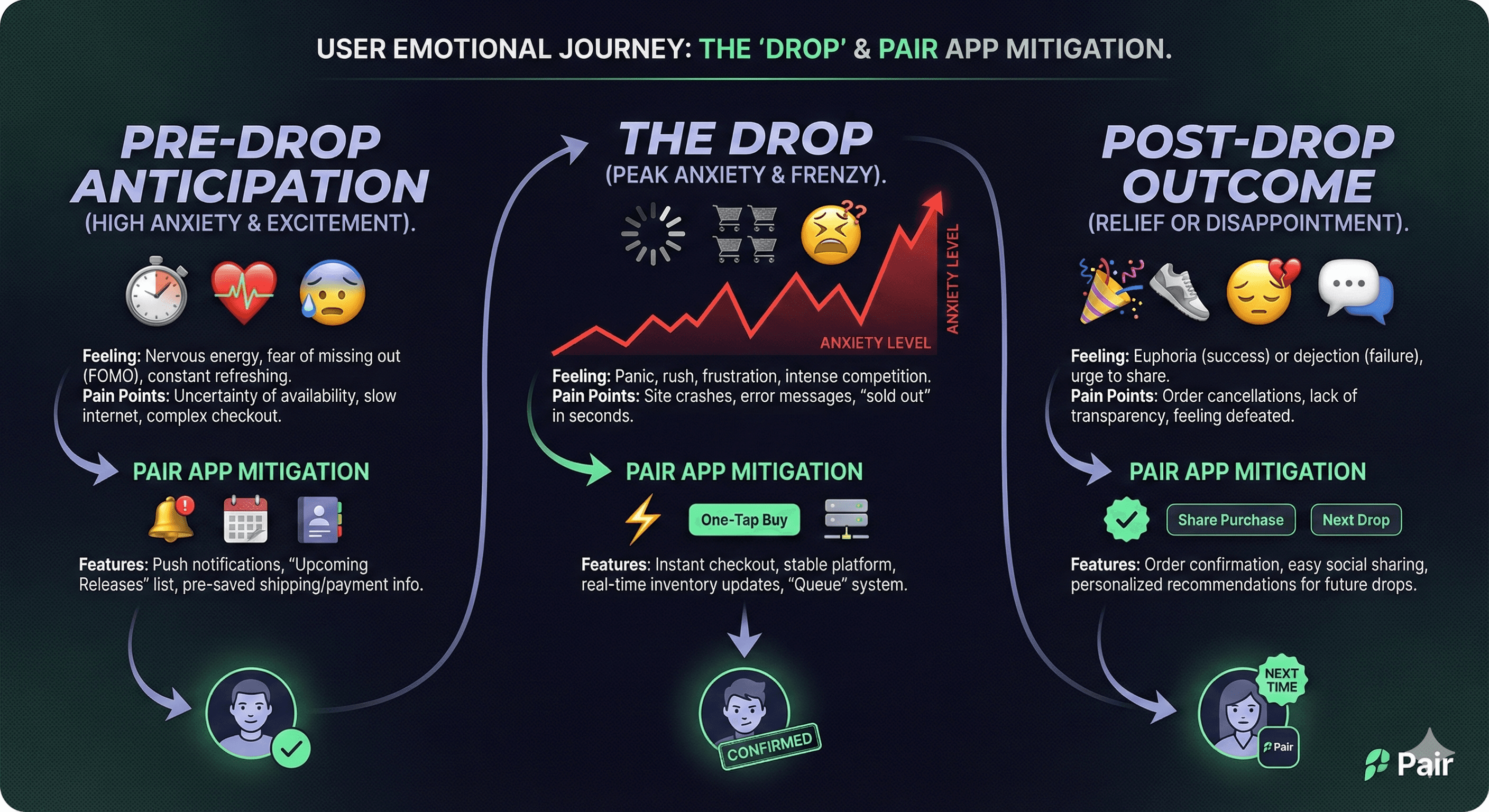
USER INSIGHTS & KEY ACTIONS:
• Users trust platforms that feel premium and curated, prompting a more editorial visual direction.
• Sneaker shoppers value speed and clarity: fewer taps, faster product scanning, and straightforward pathways to buy or sell.
• Collectors want identity expression, leading to profile enhancements that showcase activity and preferences.
• News and style content is a major engagement driver, encouraging a blended commerce-editorial approach.
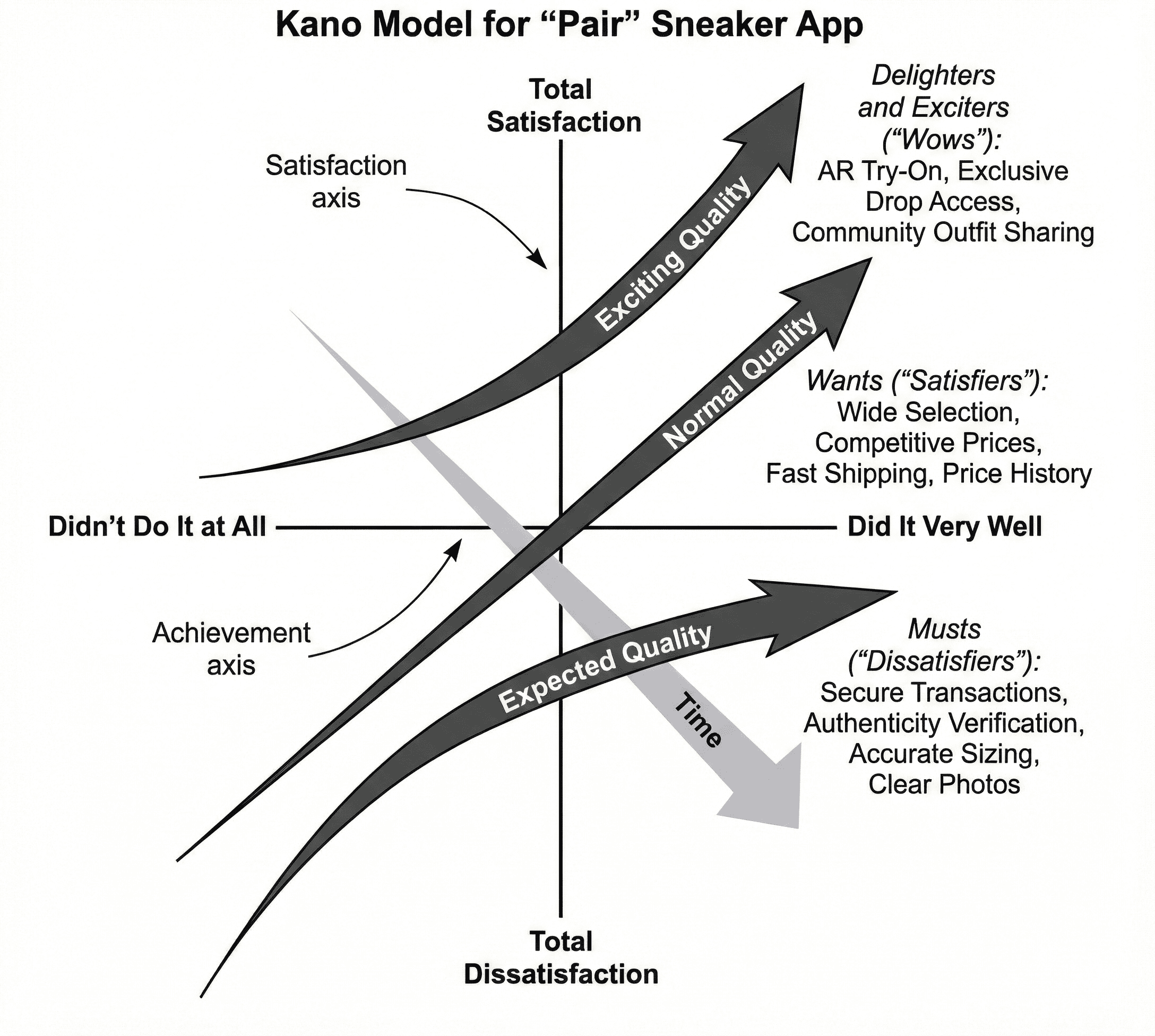
KANO MODEL:
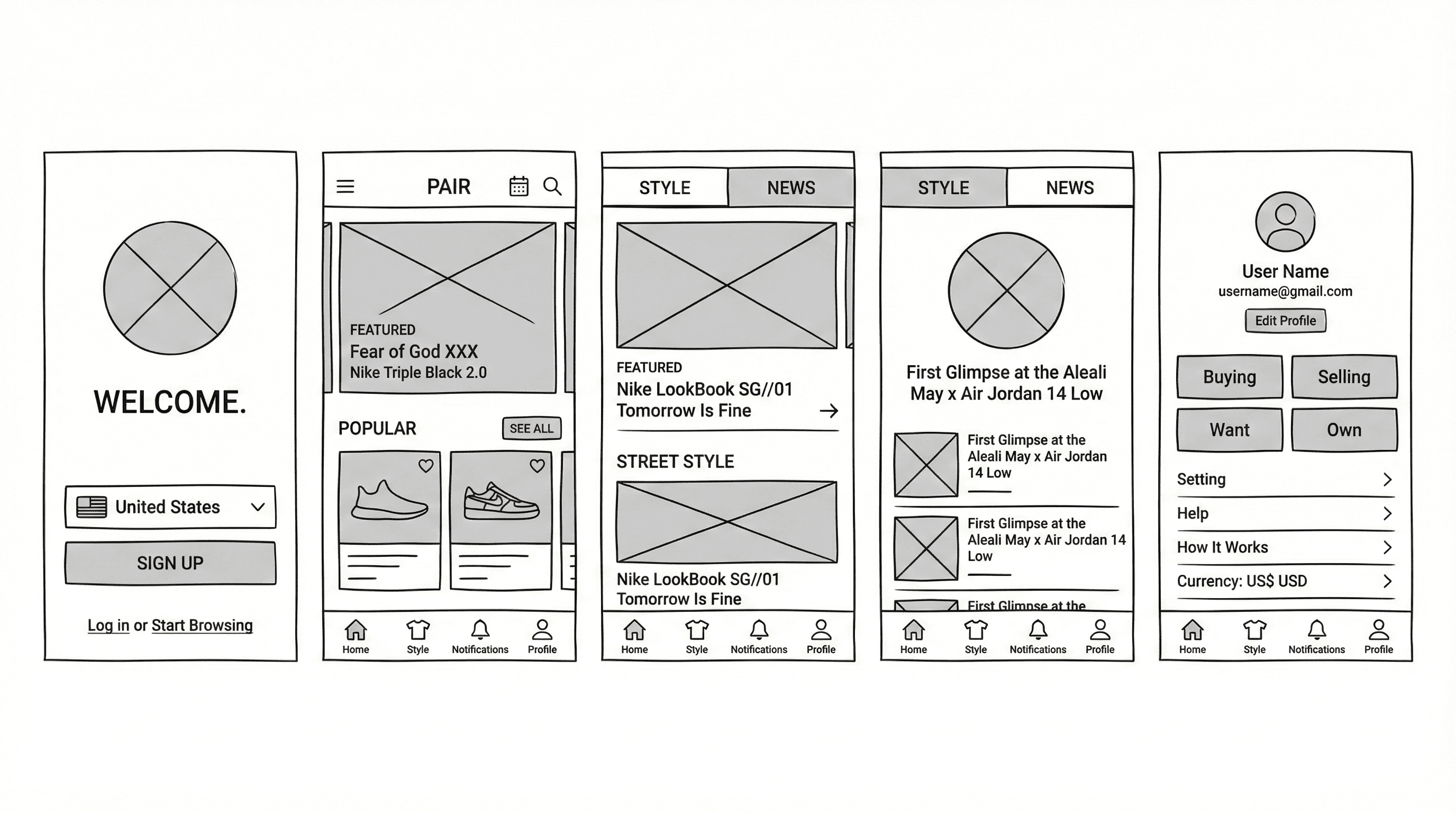
WIREFRAMES:
THE SOLUTION:
The final solution delivers a high-end sneaker marketplace with a bold visual identity, intuitive flows, and immersive product storytelling. Every surface was shaped to enhance trust, clarity, and cultural relevance - bridging editorial design and commerce in a mobile-first environment.
• High-impact hero banners featuring featured drops and limited releases.
• Category carousels optimized for quick comparison and scanning.
• A dual-tab content hub (Style / News) showcasing articles, lookbooks, and trends.
• Personalized account hub with structured actions and quick-access filters.
• Clean onboarding with immediate country selection and simple sign-up.
• Consistent black-on-black aesthetic with white typography for contrast and luxury cues.
• Modular components adaptable for future product lines, events, and collaborations.
UI DOCUMENTION:

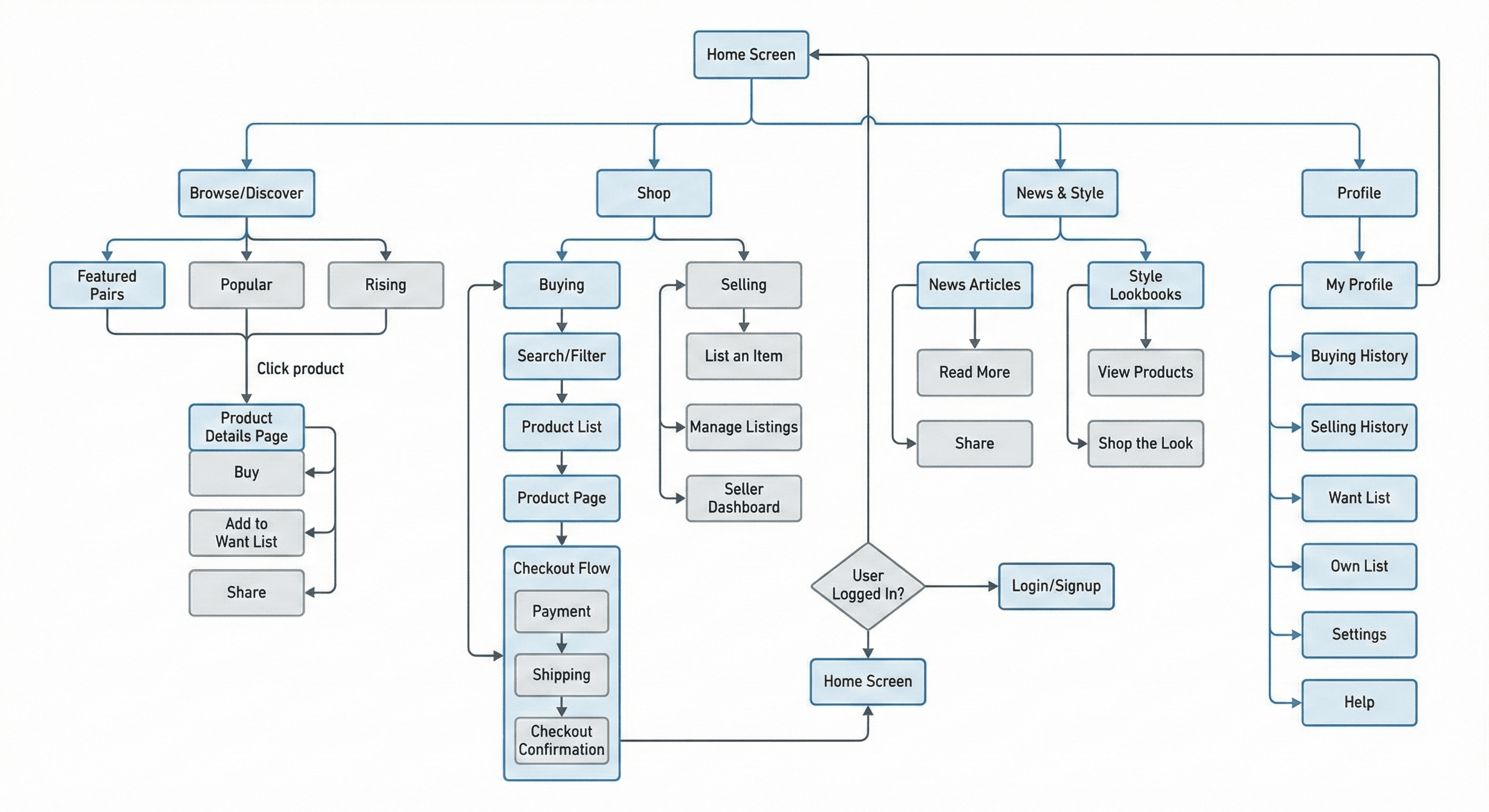
USER FLOW:
USER PERSONAS:
EMPATHY MAP:
DESIGN SYSTEM (MINI):
OUTCOME / RESULT:
The redesigned experience enhances user confidence, sharpens navigation clarity, and increases engagement through strong visual hooks and cultural content. Users benefit from faster decision-making, improved seller evaluation, and an overall premium feel aligned with sneaker culture’s aesthetics. The interface reduces cognitive load, improves usability in low-light environments, and elevates the marketplace into a lifestyle-driven platform.
LEARNING / CONCLUSION:
This project reinforced the value of merging editorial storytelling with commerce to improve engagement and brand perception. A strong visual system not only enhances usability but also shapes trust in high-value markets like sneaker resale. The final design establishes Pair as a culturally aware, premium, and user-centric platform capable of scaling across trends, releases, and community behaviors.
More Works
(HNS® — 02)

FAQ
01
What’s your typical workflow for new projects?
02
How do you determine project timelines?
03
Do you design for both web and mobile?
04
What are your payment terms?
05
Can I update my website or app after launch?
06
Do you only work on fixed projects, or do you offer ongoing support?
07
Can you help with branding too?
08
What file formats will I receive for design handoff?
2025
Pair – A Mobile App
The app provides a complete end-to-end journey for both buyers and sellers of high-demand sneakers
UI/UX
MOBILE APP
ABOUT THE BRAND:
Pair is a premium sneaker marketplace built for collectors, resellers, and enthusiasts who view footwear as both identity and investment. The brand blends culture with commerce, offering a clean, cinematic interface where users can browse, buy, sell, and track coveted sneakers with confidence.
PROJECT OVERVIEW:
Pair is a mobile marketplace designed for sneaker enthusiasts who value authenticity, visual storytelling, and a curated browsing experience. The project focuses on crafting a high-contrast, editorial-grade interface that elevates product discovery, simplifies buying and selling, and supports a community built around culture, style, and scarcity
PROJECT GOAL:
The goal was to build a visually distinct, easy-to-navigate sneaker marketplace that communicates authenticity, increases trust, and supports both impulse browsing and intentional buying. The app needed to reduce friction in listing items, improve discovery, and strengthen user identity through customizable profiles.
ROLE:
PRODUCT DESIGNER
THE PROBLEM:
Sneaker marketplaces often suffer from cluttered interfaces, weak visual hierarchy, and difficulty distinguishing verified sellers from casual listers. Users struggle to browse efficiently, evaluate credibility, and navigate between content (news/style) and commerce. The challenge was to create an app that feels premium, intuitive, and editorial while supporting a robust commerce workflow.
THE APPROACH AND PROCESS:
The design process combined competitive analysis, visual direction mapping, and user-flow refinement to create a premium shopping experience that feels both cinematic and functional. Emphasis was placed on hierarchy, dark-mode aesthetics, and a modular card system tailored for high-contrast footwear imagery.
• Defined the core navigation model using a five-tab structure to separate browsing, content, alerts, and profile actions.
• Developed an onboarding and welcome screen with bold typography and hero imagery to set the brand tone instantly.
• Designed an immersive home screen featuring large editorial banners, featured drops, and category-specific carousels.
• Built a dual-mode content section (Style / News) for culture-driven storytelling that keeps users engaged beyond transactions.
• Created a refined profile system with clear segmentation of Buying, Selling, Want, and Own states.
• Established consistent spacing, iconography rules, and editorial typography to maintain a premium aesthetic across screens.
• Conducted iterative UI refinements to strengthen tap targets, accessibility, and card-level affordances.
USER INSIGHTS & KEY ACTIONS:
• Users trust platforms that feel premium and curated, prompting a more editorial visual direction.
• Sneaker shoppers value speed and clarity: fewer taps, faster product scanning, and straightforward pathways to buy or sell.
• Collectors want identity expression, leading to profile enhancements that showcase activity and preferences.
• News and style content is a major engagement driver, encouraging a blended commerce-editorial approach.
KANO MODEL:
WIREFRAMES:
THE SOLUTION:
The final solution delivers a high-end sneaker marketplace with a bold visual identity, intuitive flows, and immersive product storytelling. Every surface was shaped to enhance trust, clarity, and cultural relevance - bridging editorial design and commerce in a mobile-first environment.
• High-impact hero banners featuring featured drops and limited releases.
• Category carousels optimized for quick comparison and scanning.
• A dual-tab content hub (Style / News) showcasing articles, lookbooks, and trends.
• Personalized account hub with structured actions and quick-access filters.
• Clean onboarding with immediate country selection and simple sign-up.
• Consistent black-on-black aesthetic with white typography for contrast and luxury cues.
• Modular components adaptable for future product lines, events, and collaborations.
UI DOCUMENTION:
USER FLOW:
USER PERSONAS:
EMPATHY MAP:
DESIGN SYSTEM (MINI):
OUTCOME / RESULT:
The redesigned experience enhances user confidence, sharpens navigation clarity, and increases engagement through strong visual hooks and cultural content. Users benefit from faster decision-making, improved seller evaluation, and an overall premium feel aligned with sneaker culture’s aesthetics. The interface reduces cognitive load, improves usability in low-light environments, and elevates the marketplace into a lifestyle-driven platform.
LEARNING / CONCLUSION:
This project reinforced the value of merging editorial storytelling with commerce to improve engagement and brand perception. A strong visual system not only enhances usability but also shapes trust in high-value markets like sneaker resale. The final design establishes Pair as a culturally aware, premium, and user-centric platform capable of scaling across trends, releases, and community behaviors.
More Works
(HNS® — 02)
FAQ
01
What’s your typical workflow for new projects?
02
How do you determine project timelines?
03
Do you design for both web and mobile?
04
What are your payment terms?
05
Can I update my website or app after launch?
06
Do you only work on fixed projects, or do you offer ongoing support?
07
Can you help with branding too?
08
What file formats will I receive for design handoff?
2025
Pair – A Mobile App
The app provides a complete end-to-end journey for both buyers and sellers of high-demand sneakers
UI/UX
MOBILE APP
ABOUT THE BRAND:
Pair is a premium sneaker marketplace built for collectors, resellers, and enthusiasts who view footwear as both identity and investment. The brand blends culture with commerce, offering a clean, cinematic interface where users can browse, buy, sell, and track coveted sneakers with confidence.
PROJECT OVERVIEW:
Pair is a mobile marketplace designed for sneaker enthusiasts who value authenticity, visual storytelling, and a curated browsing experience. The project focuses on crafting a high-contrast, editorial-grade interface that elevates product discovery, simplifies buying and selling, and supports a community built around culture, style, and scarcity
PROJECT GOAL:
The goal was to build a visually distinct, easy-to-navigate sneaker marketplace that communicates authenticity, increases trust, and supports both impulse browsing and intentional buying. The app needed to reduce friction in listing items, improve discovery, and strengthen user identity through customizable profiles.
ROLE:
PRODUCT DESIGNER
THE PROBLEM:
Sneaker marketplaces often suffer from cluttered interfaces, weak visual hierarchy, and difficulty distinguishing verified sellers from casual listers. Users struggle to browse efficiently, evaluate credibility, and navigate between content (news/style) and commerce. The challenge was to create an app that feels premium, intuitive, and editorial while supporting a robust commerce workflow.
THE APPROACH AND PROCESS:
The design process combined competitive analysis, visual direction mapping, and user-flow refinement to create a premium shopping experience that feels both cinematic and functional. Emphasis was placed on hierarchy, dark-mode aesthetics, and a modular card system tailored for high-contrast footwear imagery.
• Defined the core navigation model using a five-tab structure to separate browsing, content, alerts, and profile actions.
• Developed an onboarding and welcome screen with bold typography and hero imagery to set the brand tone instantly.
• Designed an immersive home screen featuring large editorial banners, featured drops, and category-specific carousels.
• Built a dual-mode content section (Style / News) for culture-driven storytelling that keeps users engaged beyond transactions.
• Created a refined profile system with clear segmentation of Buying, Selling, Want, and Own states.
• Established consistent spacing, iconography rules, and editorial typography to maintain a premium aesthetic across screens.
• Conducted iterative UI refinements to strengthen tap targets, accessibility, and card-level affordances.
USER INSIGHTS & KEY ACTIONS:
• Users trust platforms that feel premium and curated, prompting a more editorial visual direction.
• Sneaker shoppers value speed and clarity: fewer taps, faster product scanning, and straightforward pathways to buy or sell.
• Collectors want identity expression, leading to profile enhancements that showcase activity and preferences.
• News and style content is a major engagement driver, encouraging a blended commerce-editorial approach.
KANO MODEL:
WIREFRAMES:
THE SOLUTION:
The final solution delivers a high-end sneaker marketplace with a bold visual identity, intuitive flows, and immersive product storytelling. Every surface was shaped to enhance trust, clarity, and cultural relevance - bridging editorial design and commerce in a mobile-first environment.
• High-impact hero banners featuring featured drops and limited releases.
• Category carousels optimized for quick comparison and scanning.
• A dual-tab content hub (Style / News) showcasing articles, lookbooks, and trends.
• Personalized account hub with structured actions and quick-access filters.
• Clean onboarding with immediate country selection and simple sign-up.
• Consistent black-on-black aesthetic with white typography for contrast and luxury cues.
• Modular components adaptable for future product lines, events, and collaborations.
UI DOCUMENTION:
USER FLOW:
USER PERSONAS:
EMPATHY MAP:
DESIGN SYSTEM (MINI):
OUTCOME / RESULT:
The redesigned experience enhances user confidence, sharpens navigation clarity, and increases engagement through strong visual hooks and cultural content. Users benefit from faster decision-making, improved seller evaluation, and an overall premium feel aligned with sneaker culture’s aesthetics. The interface reduces cognitive load, improves usability in low-light environments, and elevates the marketplace into a lifestyle-driven platform.
LEARNING / CONCLUSION:
This project reinforced the value of merging editorial storytelling with commerce to improve engagement and brand perception. A strong visual system not only enhances usability but also shapes trust in high-value markets like sneaker resale. The final design establishes Pair as a culturally aware, premium, and user-centric platform capable of scaling across trends, releases, and community behaviors.
More Works
FAQ
What’s your typical workflow for new projects?
How do you determine project timelines?
Do you design for both web and mobile?
What are your payment terms?
Can I update my website or app after launch?
Do you only work on fixed projects, or do you offer ongoing support?
Can you help with branding too?
What file formats will I receive for design handoff?