
2025
Bangladesh Railway
Bangladesh Railway is the national rail service
UI/UX
WEB DESIGN (REDESIGN)
About the Brand
Bangladesh Railway is the national rail service responsible for safe, affordable, and extensive railway transportation across the country. Its digital ticketing system supports millions of passengers daily, serving as one of the most widely used government digital services.
Project Overview
This project focuses on redesigning the official Bangladesh Railway online ticketing platform to improve usability, reduce friction, modernize the interface, and create a more trustworthy experience for travelers. The goal was to make the platform intuitive, reliable, and aligned with current UX standards.

Project Goal
Make train search and booking significantly easier.
Improve information hierarchy for schedules, announcements, and travel updates.
Increase trust through official branding, clarity, and transparency.
Reduce user confusion, especially for first-time digital users.
My Role:
Product Designer (UI/UX)
Responsible for UX architecture, user flows, wireframes, visual design, illustration selection, UI system, interaction details, and final screen design.


The Challenge
Outdated layout creating visual clutter and cognitive load.
Essential actions like booking, checking availability, and reading announcements were hard to find.
No visual hierarchy; sections blended together.
Trust signals were weak despite being a government platform.
Navigation and schedule information lacked clarity.
The Approach & Process
Research & Analysis:
Reviewed the existing platform, user complaints, navigation patterns, and friction points. Identified that most issues stemmed from poor hierarchy and inconsistent UI.
Structuring the Experience
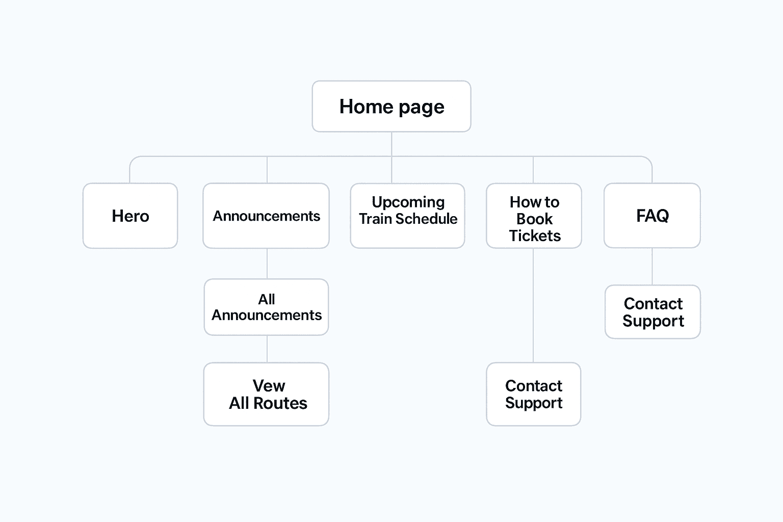
Created a clear, linear homepage journey:
1. Hero section for direct booking
2. Announcements for real-time information
3. Upcoming schedules presented visually
4. Ticket booking steps for onboarding
5. FAQ for resolving common user concerns
6. A modern, trust-focused footer
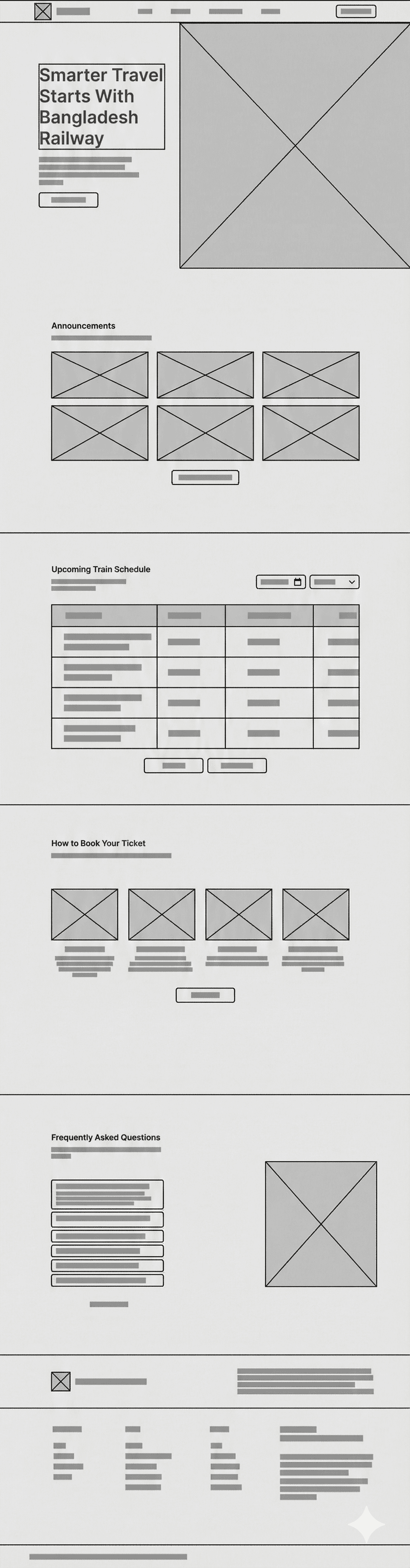
Wireframing:
Low-fidelity sketches were used to define section spacing, card structure, and information flow.
High-fidelity wireframes translated these decisions into a polished, scalable layout.
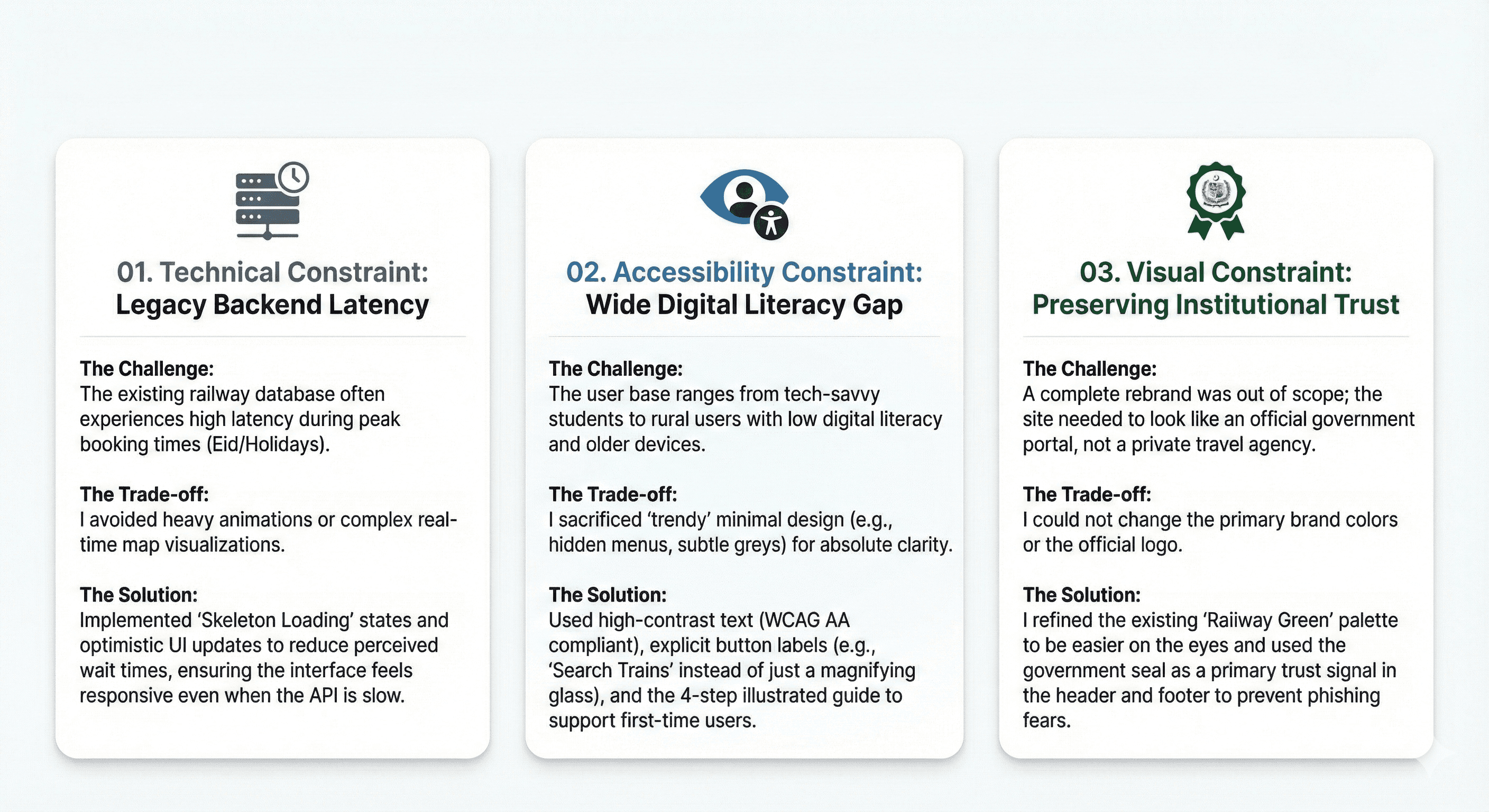
Constraints & Strategic Trade-offs:
Designing for a government platform required balancing modern aesthetics with legacy technical limitations and mass accessibility.
Visual Design:
Clean typography system (64px headline, 24px subtitle, consistent 16px body).
Accessible color palette with railway-themed green accents.
Consistent card system for announcements, schedules, and FAQs.
Custom illustrations to increase clarity and friendliness.
Strategic white space to avoid clutter.


The Solution
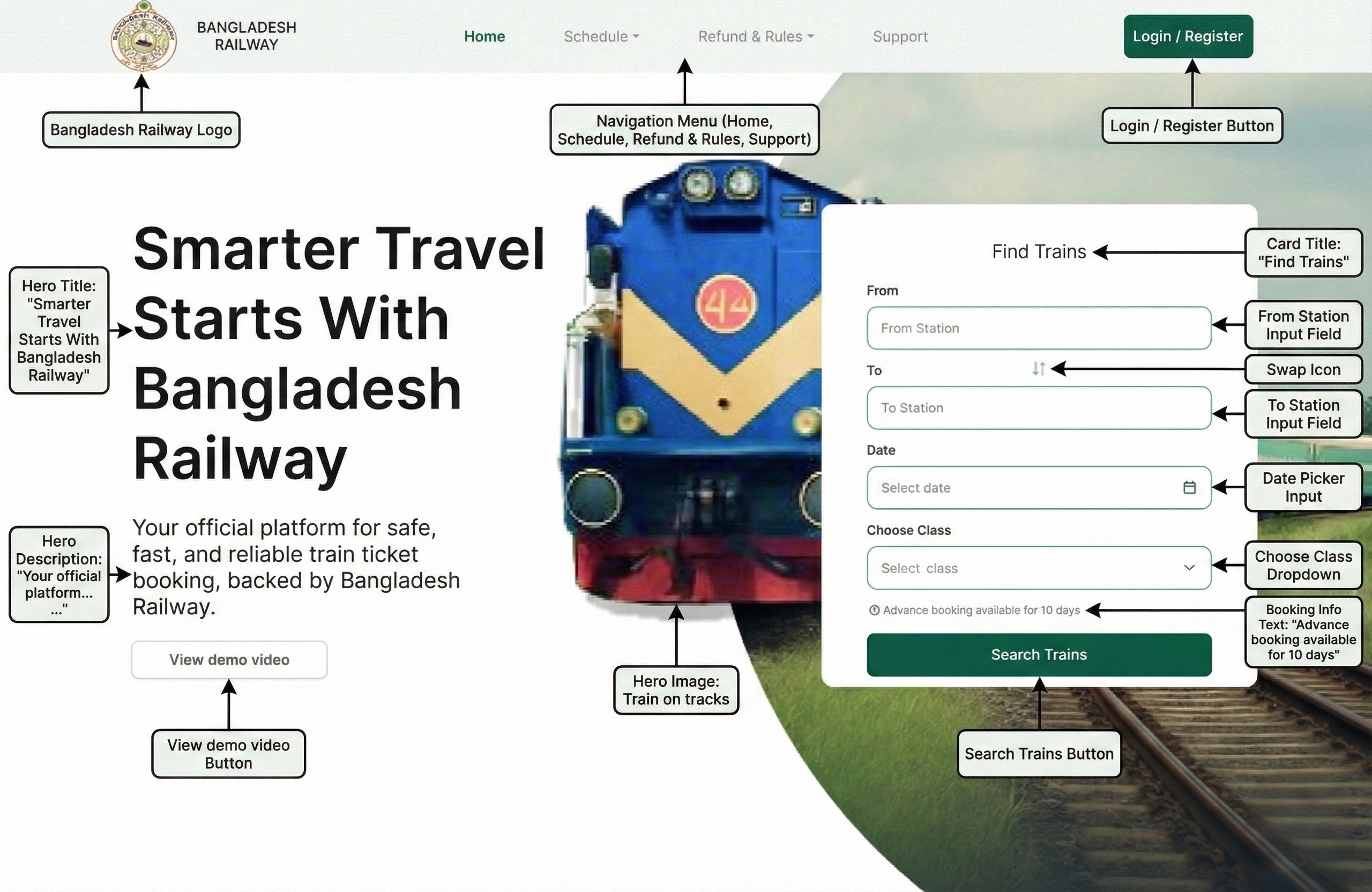
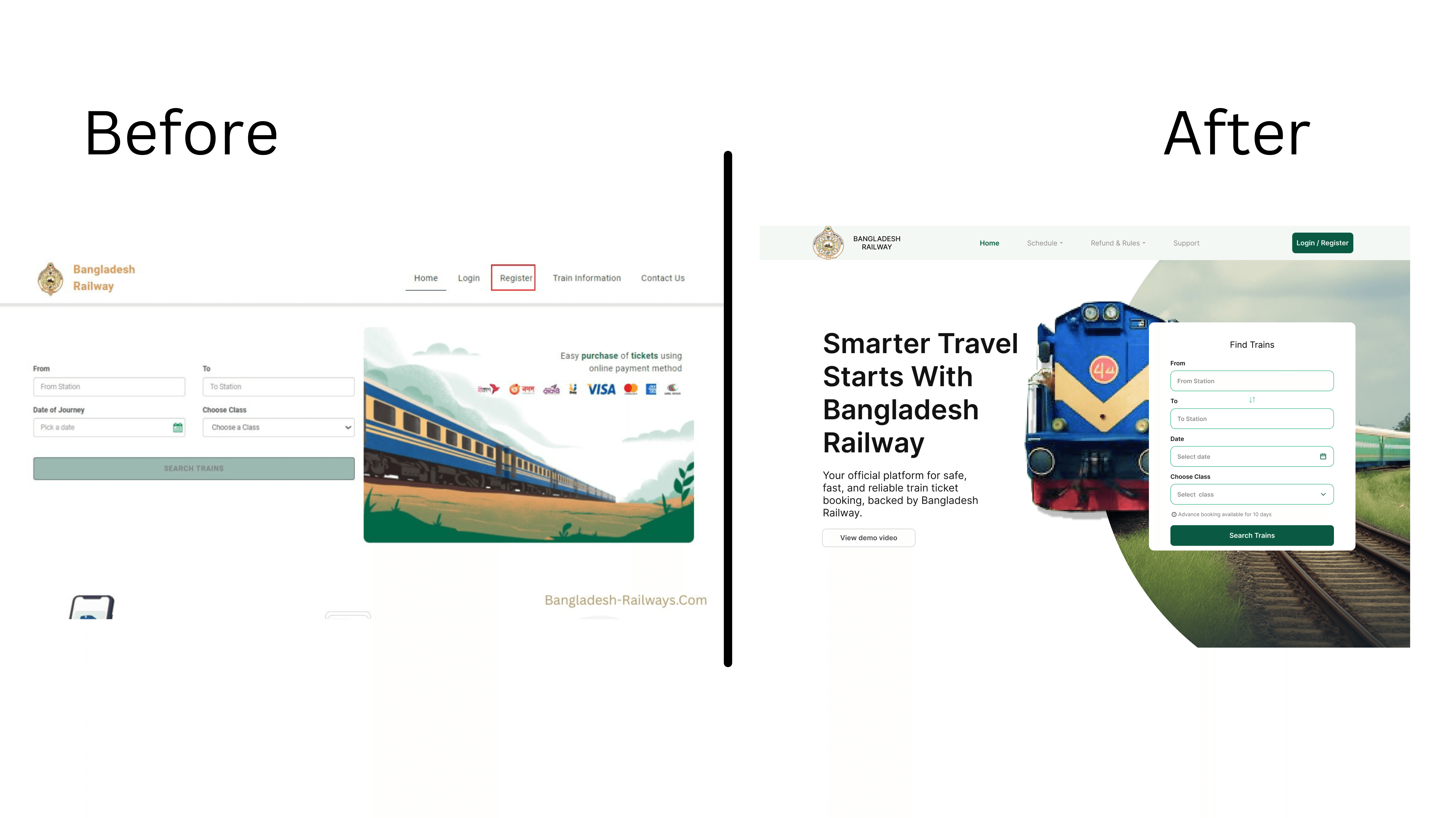
1.Hero Section:
A modern, engaging hero with a locomotive visual, clear call-to-action, simplified train finder, and a concise value statement to build trust.
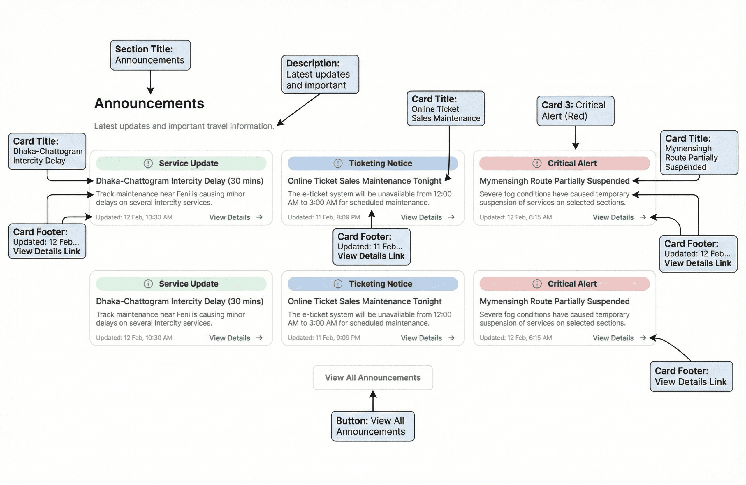
2.Announcements:
A color-coded card system representing alert levels—Service Update, Ticketing Notice, Route Advisory, and Critical Alert. Each is scannable with timestamps and actions.
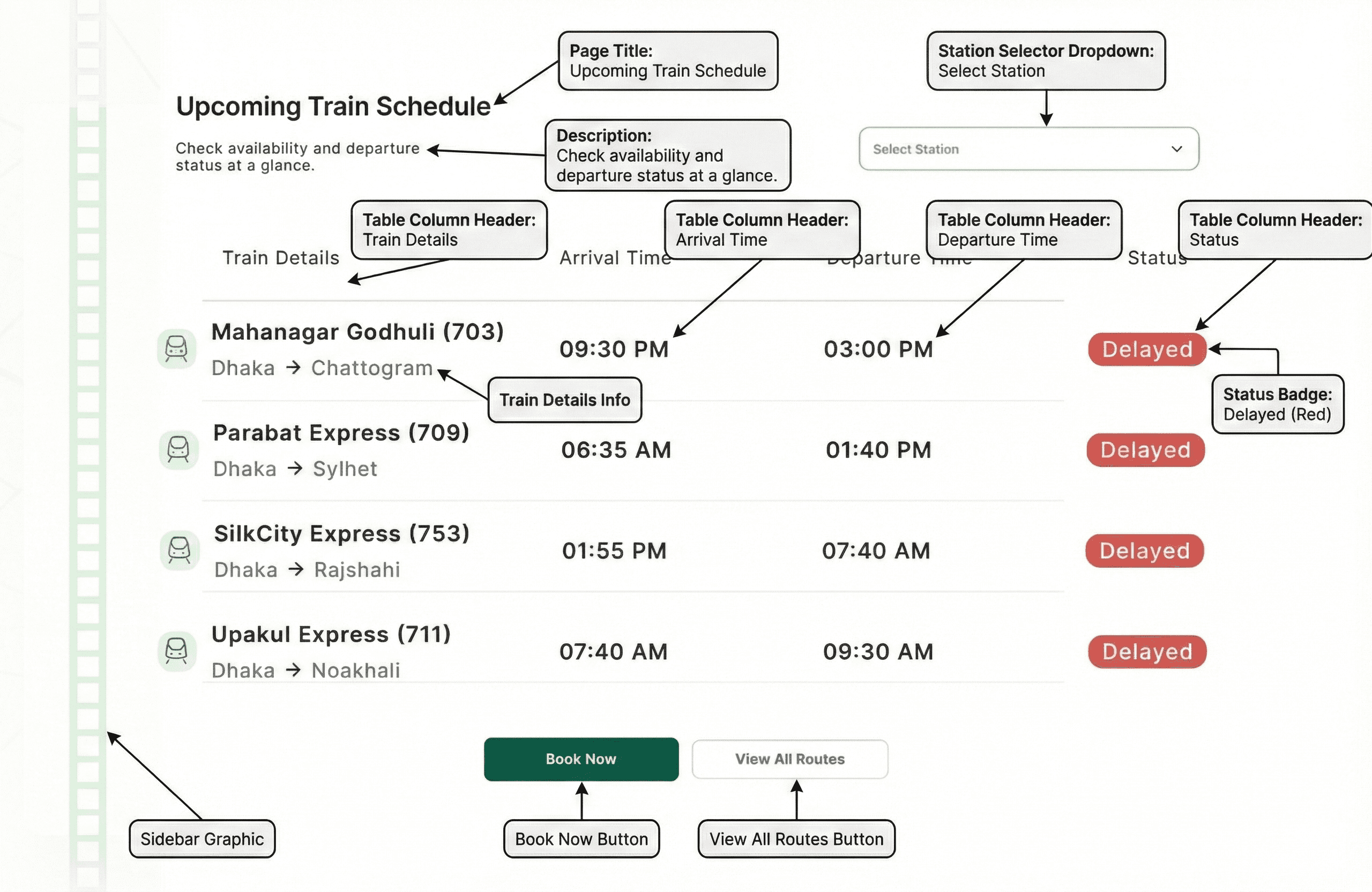
3.Upcoming Train Schedule:
A streamlined table with clear Train Details, Arrival, Departure, and Status indicators. Soft visual dividers and improved spacing enhance readability.
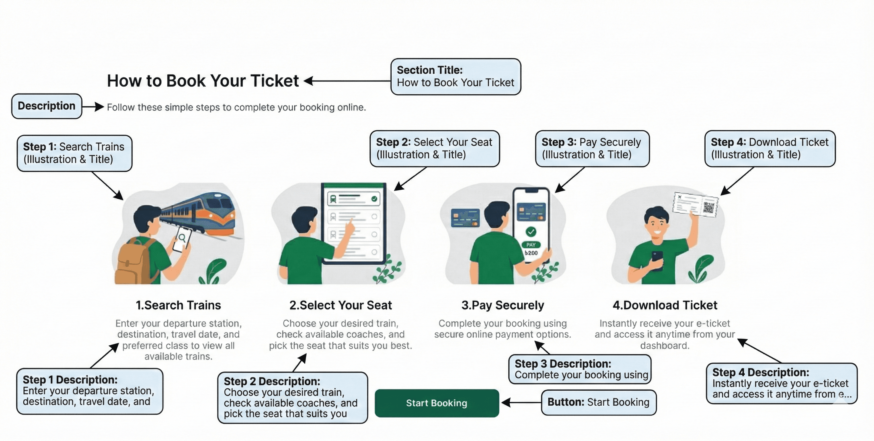
4.How to Book Tickets:
A 4-step illustrated guide clarifying the booking flow for new and non-technical users.
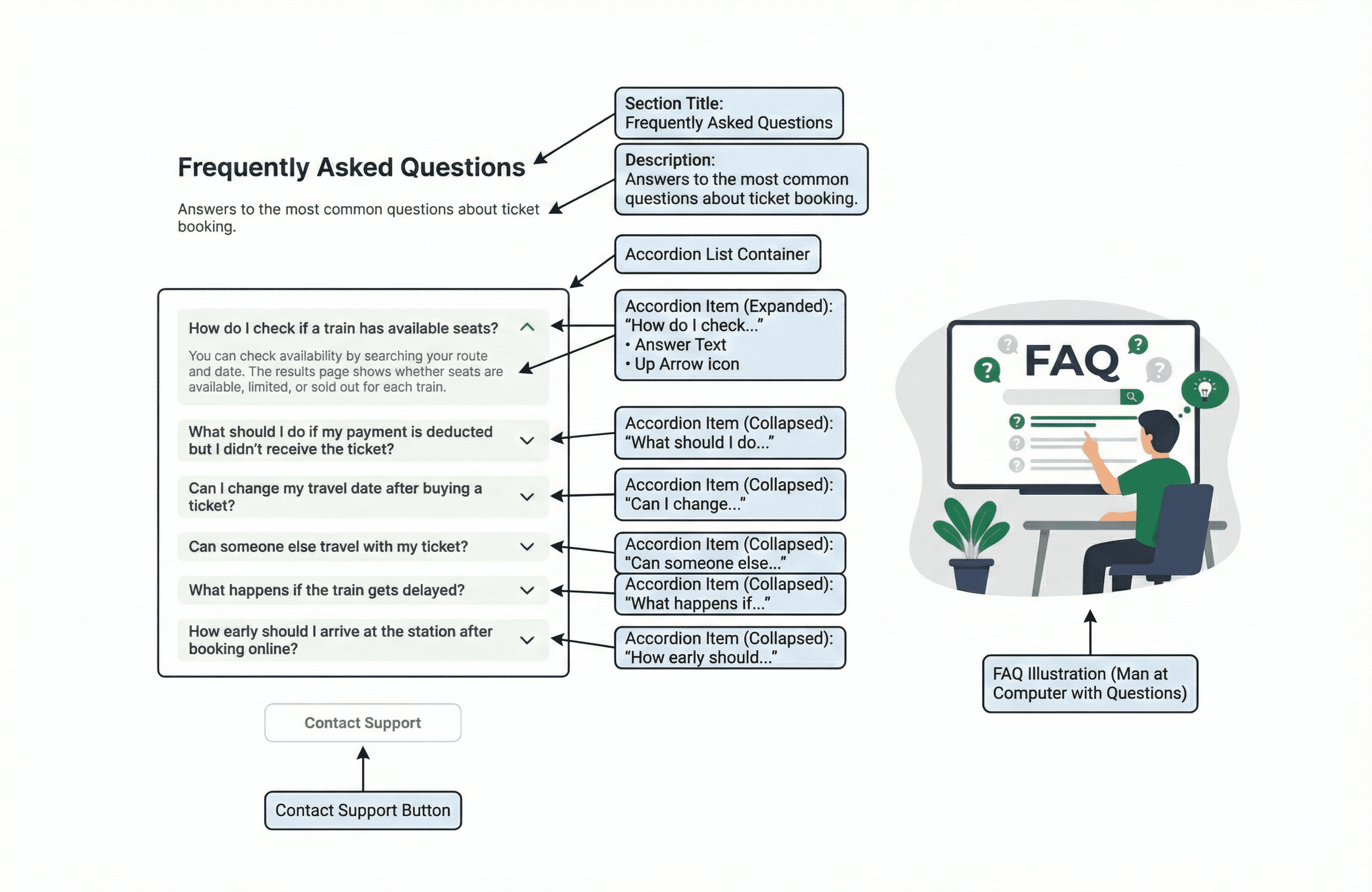
5.FAQ Section:
Accordion-based layout for quick answers paired with contextual illustrations.
Support CTA placed at the bottom for unresolved issues.
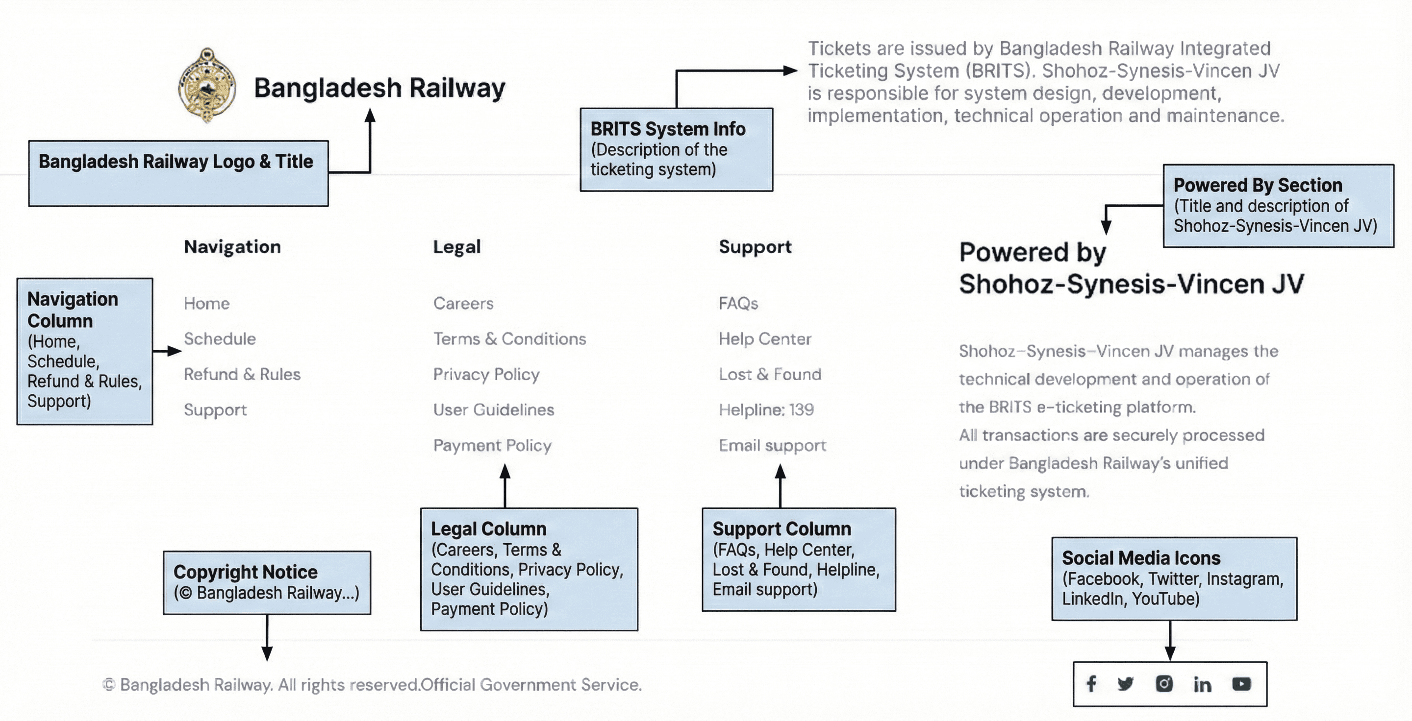
6.Footer:
A simpler, more structured footer with-
Navigation
Legal links
Support section
BRITS disclaimer
Enhanced “Powered by Shohoz-Synesis-Vincen JV” block
Before & After:
Video Preview:
Site Map:
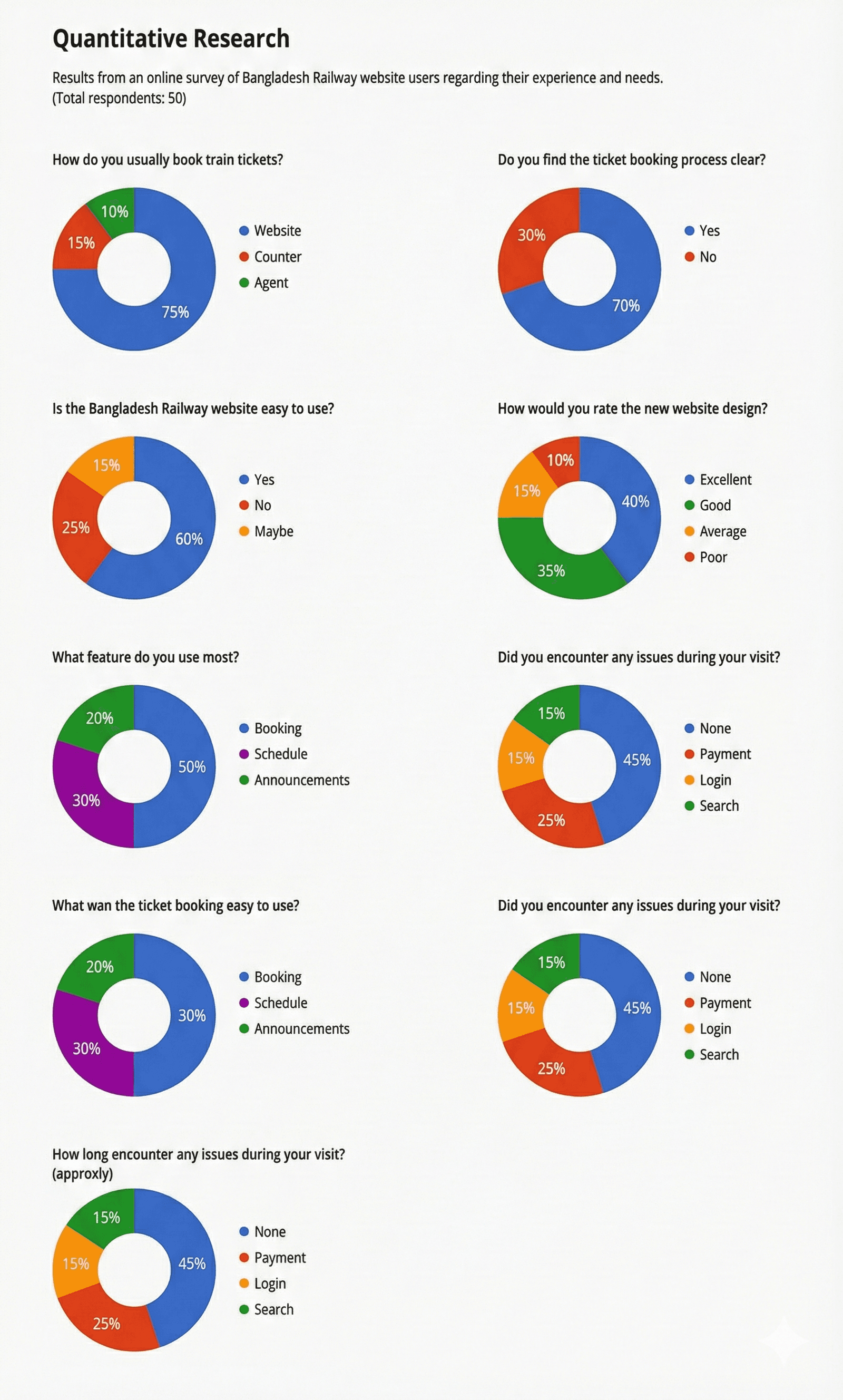
Quantative Research:
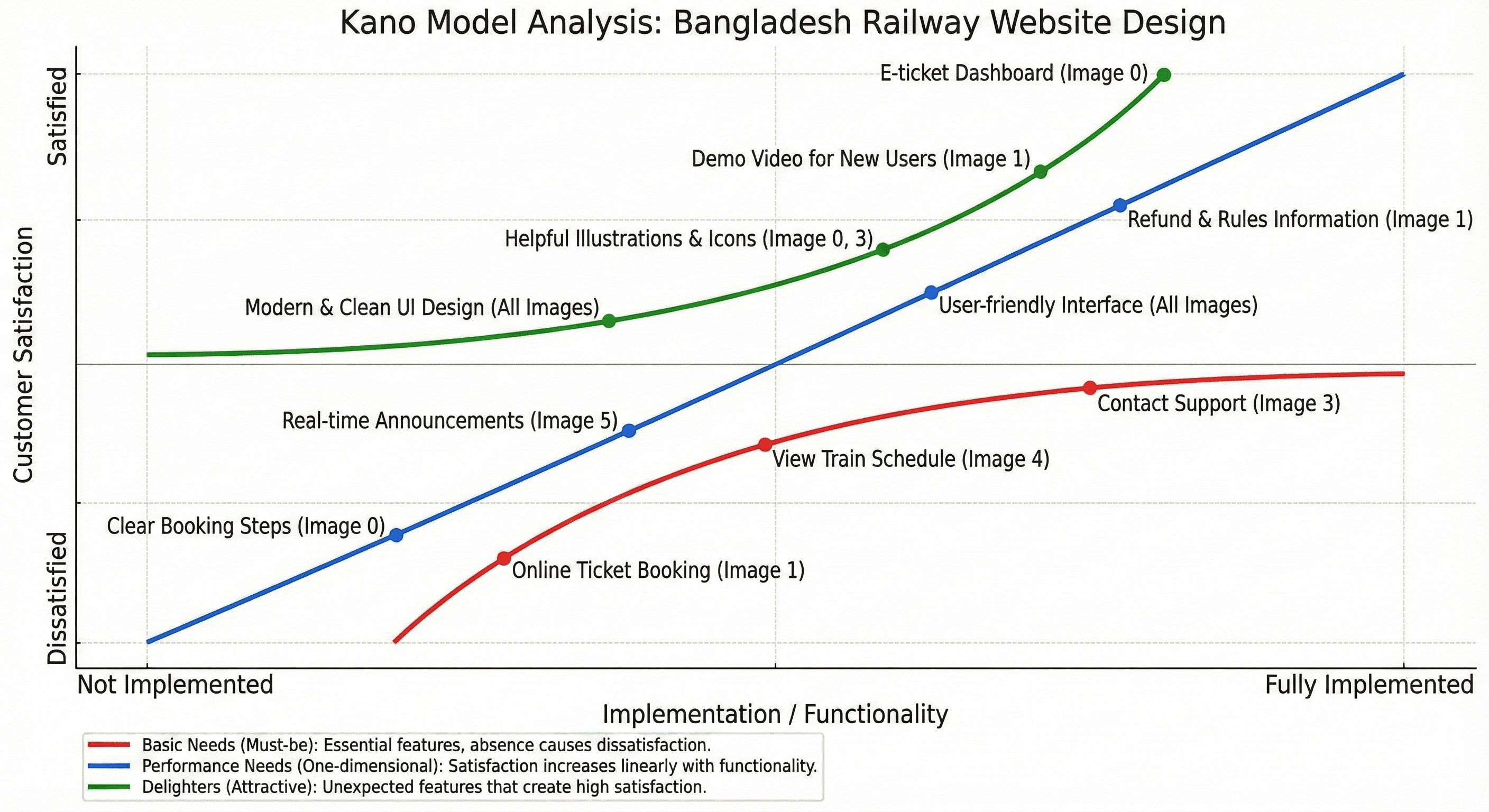
Kano Model (Hypothesis) :
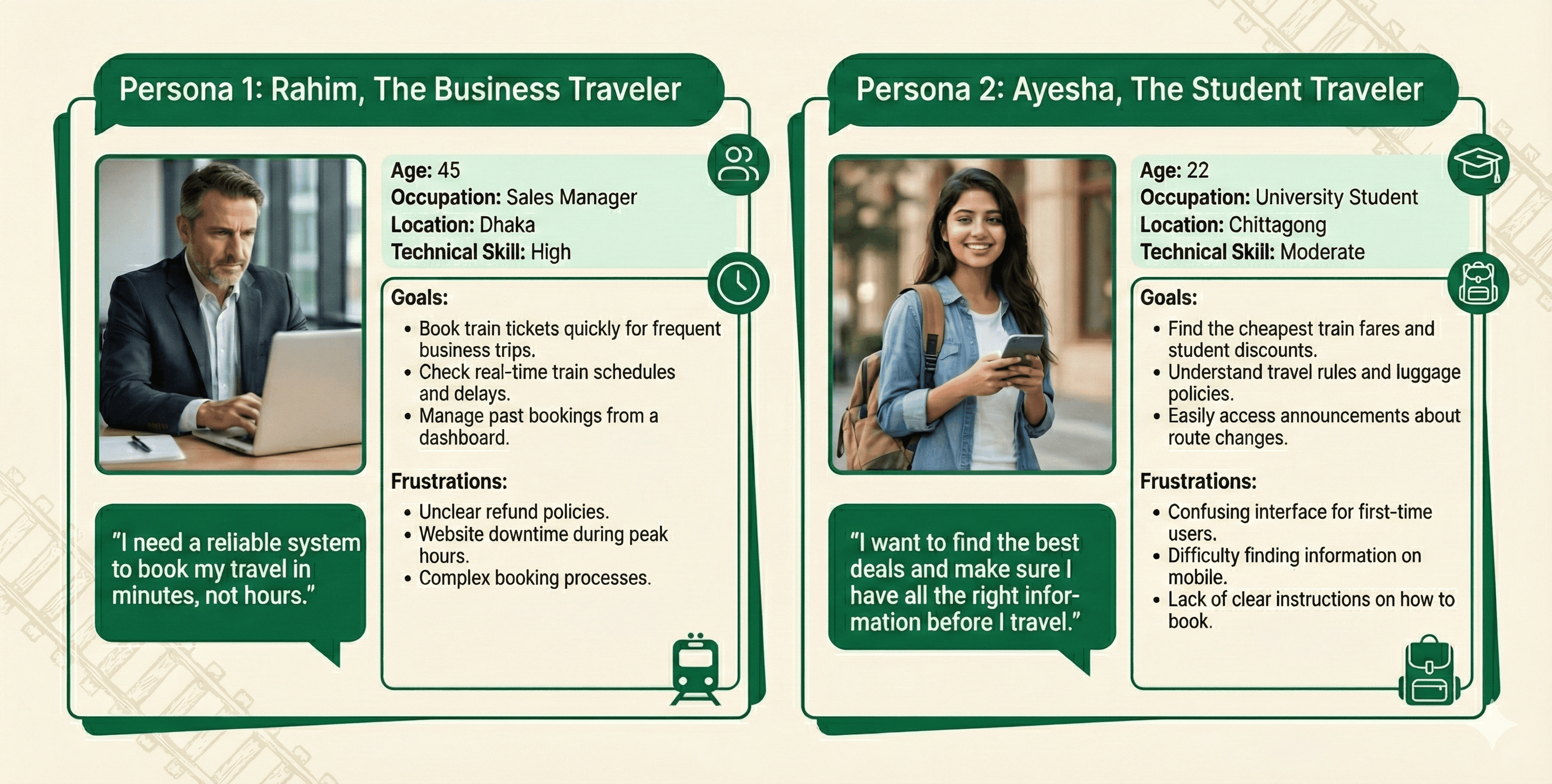
User Personas:
Projected Impact:
A cleaner interface with improved accessibility and scannability.
Reduced user confusion due to structured hierarchy and card-based patterns.
Modern, trustworthy branding suitable for a national digital service.
Streamlined booking process that supports both experienced and new digital users.
Stronger consistency across all sections leading to better UX flow.
Learnings
Designing for government services requires balancing modern UX with nationwide accessibility needs. Simplicity wins, but thoughtful structure elevates usability. Visual clarity, consistent spacing, and trust-driven language significantly improve user confidence for critical tasks like booking transport.
More Works
(HNS® — 02)
FAQ
01
What’s your typical workflow for new projects?
02
How do you determine project timelines?
03
Do you design for both web and mobile?
04
What are your payment terms?
05
Can I update my website or app after launch?
06
Do you only work on fixed projects, or do you offer ongoing support?
07
Can you help with branding too?
08
What file formats will I receive for design handoff?
2025
Bangladesh Railway
Bangladesh Railway is the national rail service
UI/UX
WEB DESIGN (REDESIGN)
About the Brand
Bangladesh Railway is the national rail service responsible for safe, affordable, and extensive railway transportation across the country. Its digital ticketing system supports millions of passengers daily, serving as one of the most widely used government digital services.
Project Overview
This project focuses on redesigning the official Bangladesh Railway online ticketing platform to improve usability, reduce friction, modernize the interface, and create a more trustworthy experience for travelers. The goal was to make the platform intuitive, reliable, and aligned with current UX standards.
Project Goal
Make train search and booking significantly easier.
Improve information hierarchy for schedules, announcements, and travel updates.
Increase trust through official branding, clarity, and transparency.
Reduce user confusion, especially for first-time digital users.
My Role:
Product Designer (UI/UX)
Responsible for UX architecture, user flows, wireframes, visual design, illustration selection, UI system, interaction details, and final screen design.
The Challenge
Outdated layout creating visual clutter and cognitive load.
Essential actions like booking, checking availability, and reading announcements were hard to find.
No visual hierarchy; sections blended together.
Trust signals were weak despite being a government platform.
Navigation and schedule information lacked clarity.
The Approach & Process
Research & Analysis:
Reviewed the existing platform, user complaints, navigation patterns, and friction points. Identified that most issues stemmed from poor hierarchy and inconsistent UI.
Structuring the Experience
Created a clear, linear homepage journey:
1. Hero section for direct booking
2. Announcements for real-time information
3. Upcoming schedules presented visually
4. Ticket booking steps for onboarding
5. FAQ for resolving common user concerns
6. A modern, trust-focused footer
Wireframing:
Low-fidelity sketches were used to define section spacing, card structure, and information flow.
High-fidelity wireframes translated these decisions into a polished, scalable layout.
Constraints & Strategic Trade-offs:
Designing for a government platform required balancing modern aesthetics with legacy technical limitations and mass accessibility.
Visual Design:
Clean typography system (64px headline, 24px subtitle, consistent 16px body).
Accessible color palette with railway-themed green accents.
Consistent card system for announcements, schedules, and FAQs.
Custom illustrations to increase clarity and friendliness.
Strategic white space to avoid clutter.
The Solution
1.Hero Section:
A modern, engaging hero with a locomotive visual, clear call-to-action, simplified train finder, and a concise value statement to build trust.
2.Announcements:
A color-coded card system representing alert levels—Service Update, Ticketing Notice, Route Advisory, and Critical Alert. Each is scannable with timestamps and actions.
3.Upcoming Train Schedule:
A streamlined table with clear Train Details, Arrival, Departure, and Status indicators. Soft visual dividers and improved spacing enhance readability.
4.How to Book Tickets:
A 4-step illustrated guide clarifying the booking flow for new and non-technical users.
5.FAQ Section:
Accordion-based layout for quick answers paired with contextual illustrations.
Support CTA placed at the bottom for unresolved issues.
6.Footer:
A simpler, more structured footer with-
Navigation
Legal links
Support section
BRITS disclaimer
Enhanced “Powered by Shohoz-Synesis-Vincen JV” block
Before & After:
Video Preview:
Site Map:
Quantative Research:
Kano Model (Hypothesis) :
User Personas:
Projected Impact:
A cleaner interface with improved accessibility and scannability.
Reduced user confusion due to structured hierarchy and card-based patterns.
Modern, trustworthy branding suitable for a national digital service.
Streamlined booking process that supports both experienced and new digital users.
Stronger consistency across all sections leading to better UX flow.
Learnings
Designing for government services requires balancing modern UX with nationwide accessibility needs. Simplicity wins, but thoughtful structure elevates usability. Visual clarity, consistent spacing, and trust-driven language significantly improve user confidence for critical tasks like booking transport.
More Works
FAQ
What’s your typical workflow for new projects?
How do you determine project timelines?
Do you design for both web and mobile?
What are your payment terms?
Can I update my website or app after launch?
Do you only work on fixed projects, or do you offer ongoing support?
Can you help with branding too?
What file formats will I receive for design handoff?