
2025
RestoSuite — DASHBOARD
A premium SaaS dashboard built for small-to-medium restaurants and multi-location operators who need clear operational visibility during service.
UI/UX
Dashboard ( SaaS)
ABOUT THE BRAND:
RestoSuite is the operating system for modern restaurants-built to streamline daily operations with clarity, precision, and control. It brings orders, inventory, staff management, and real-time reporting into one elegant, unified workspace that any restaurant can rely on.Designed for speed and consistency, RestoSuite gives owners and teams the tools to run smarter: cleaner workflows, instant insights, and a consistent connection between kitchen, floor, and management. Everything you need to operate with confidence- organized, visible, and effortlessly manageable.A premium SaaS platform crafted for restaurants that value efficiency, intelligence, and growth.
PROJECT OVERVIEW:
RestoSuite is a web-based operations dashboard designed to centralize orders, inventory, staff, and reporting for restaurants. The interface consolidates real-time KPIs, an orders table, and contextual order detail panels to reduce friction between front-of-house and kitchen workflows. Visual hierarchy and micro-interactions guide rapid decision-making for managers and shift leads.

PROJECT GOAL:
• Provide a single-screen operational view that reduces handoffs and manual coordination during peak service.
• Decrease order handling time by improving discoverability of high-priority items and statuses.
• Surface actionable KPIs and trend signals so managers can make informed staffing and inventory decisions in real time.
MY ROLE:
Product Designer
Responsible for UX strategy, information architecture, visual direction, and full UI execution. Managed the end-to-end design process, including layout systems, typography, color direction, component structure, interaction design, and content hierarchy.

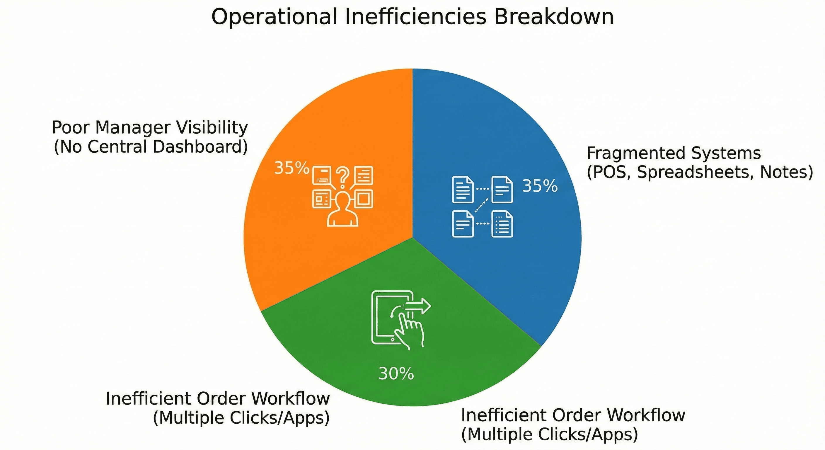
THE PROBLEM:
• Operational visibility was fragmented across point-of-sale, spreadsheets, and ad-hoc notes, causing delayed responses and order mistakes.
• Managers lacked a clear, scannable dashboard showing occupancy, active orders, revenue trends, and queue backlog simultaneously.
• Order detail and status changes required multiple clicks or separate apps, increasing cognitive load for staff during service.
THE APPROACH AND PROCESS:
We defined a compact, role-focused dashboard that prioritizes glanceable information, and iterated using low-fidelity flows and stakeholder walkthroughs to validate assumptions. Emphasis was placed on table affordances, status signaling, and a contextual order panel so staff can act without leaving the screen.
• Conducted stakeholder interviews with managers and kitchen leads to map critical tasks and pain points.
• Mapped user journeys for peak and off-peak scenarios to identify required data density and controls.
• Created wireframes focusing on left-anchored navigation and a central orders table for rapid scanning.
• Designed a contextual slide-out order summary to show item-level details and quick actions.
• Built KPI cards and a sales chart to provide trend context and prompt operational decisions.
• Validated visuals and interaction patterns through in-person usability tests during service simulations.
USER INSIGHTS & KEY ACTIONS:
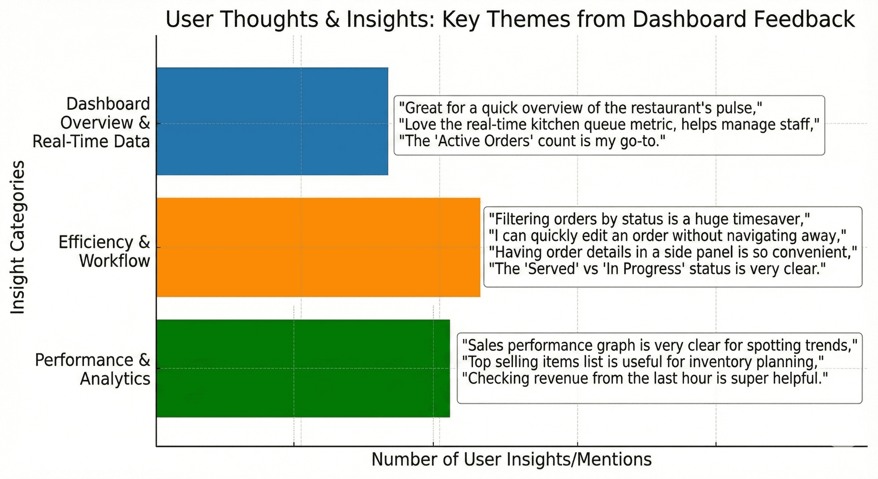
• Insight: Managers need immediate awareness of exceptions (delays, cancellations). Action: Introduced distinct status badges and a “Change Status” primary action in the order panel.
• Insight: Floor staff scan tables left-to-right quickly. Action: Optimized the orders table columns for predictable reading order: Order#, Time, Table, Reservation, Amount, Status.
• Insight: Revenue and queue trends inform short-term staffing. Action: Added compact KPI cards and an hourly sales chart on the dashboard.
• Insight: Item-level details are used to prep kitchen priorities. Action: Added itemized order view with subtotal, tax, and edit affordance in the panel.
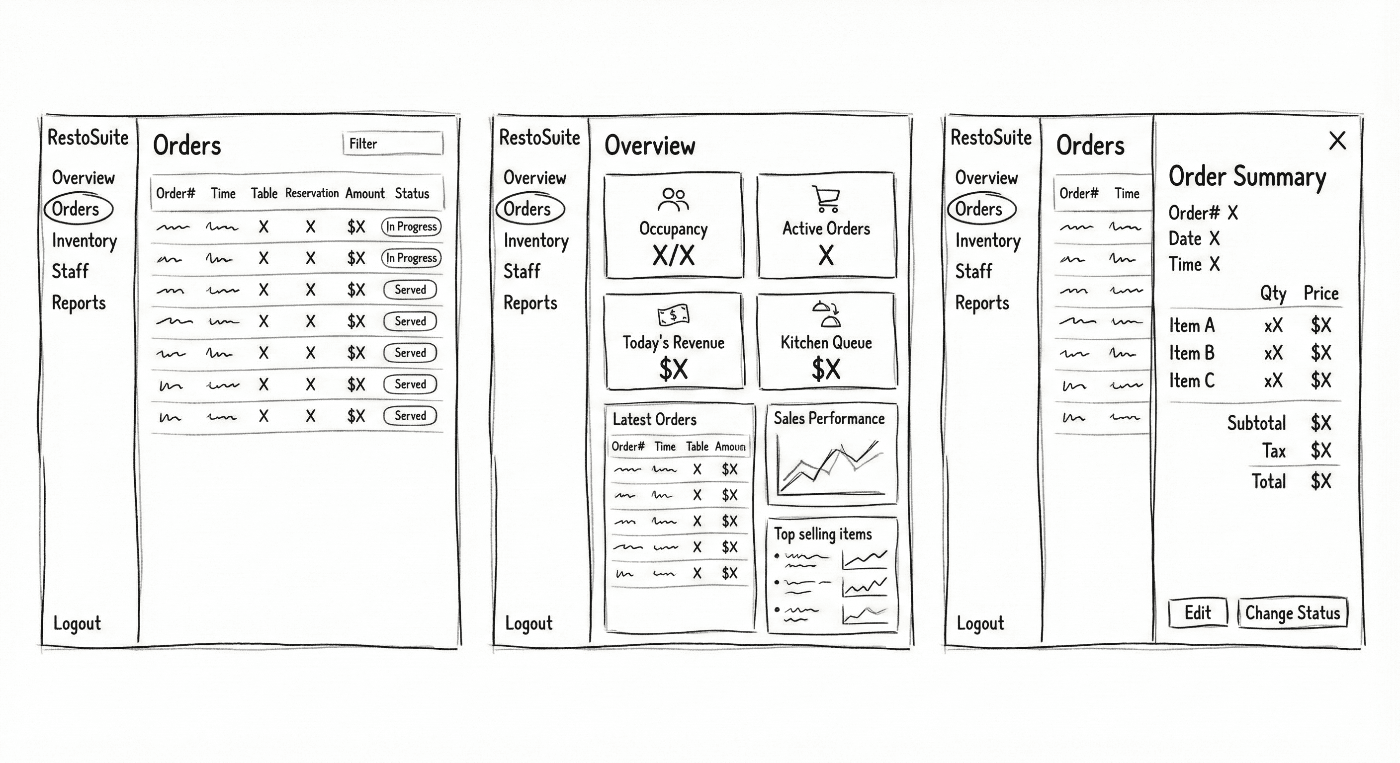
WIREFRAME:
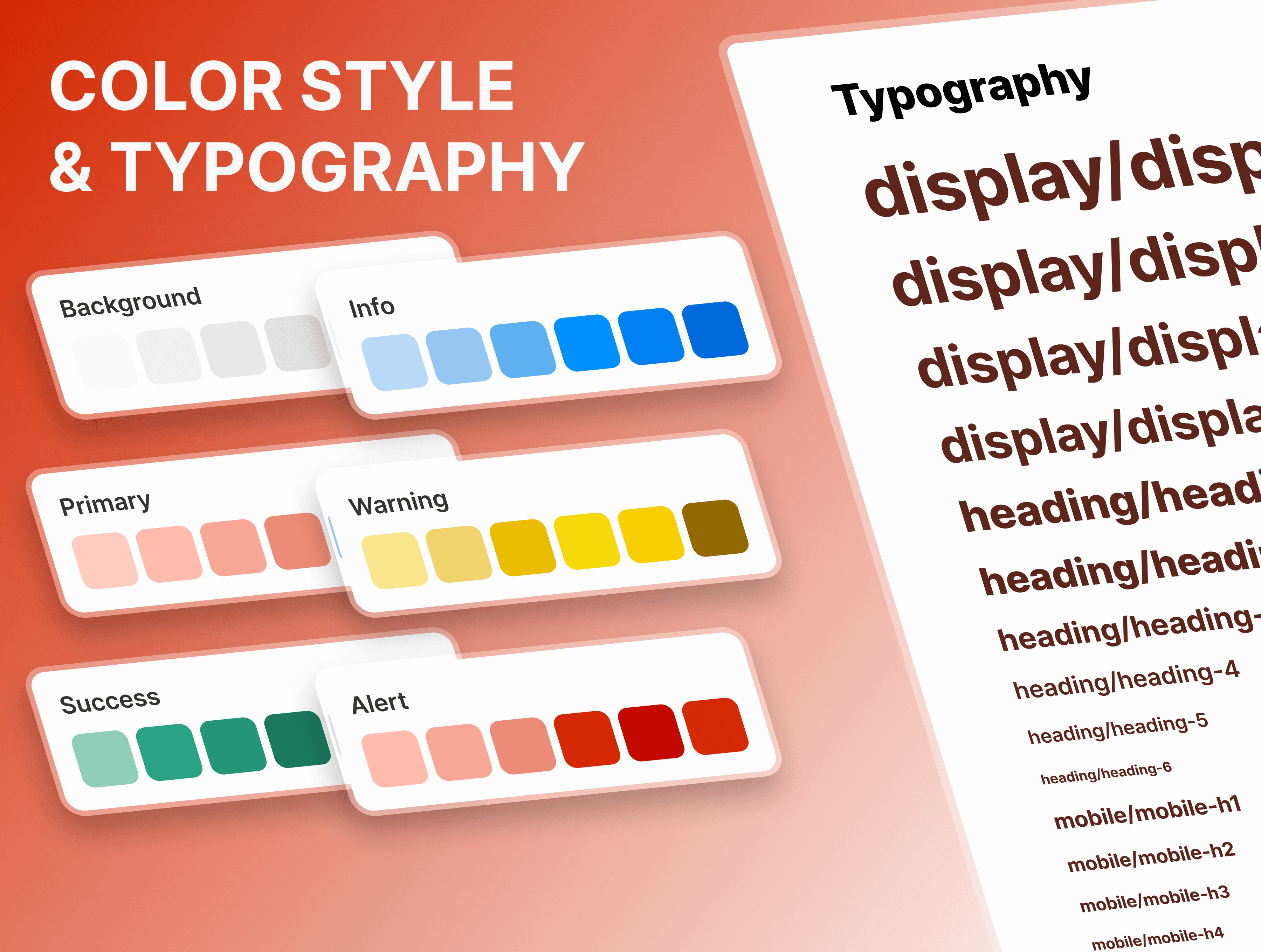
DESIGN SYSTEM:
WCAG ACCESSIBILITY DISCLAIMER:
Designed with WCAG 2.1 AA principles as a baseline. Future roadmap includes full accessibility auditing and screen-reader validation for production readiness.
THE SOLUTION:
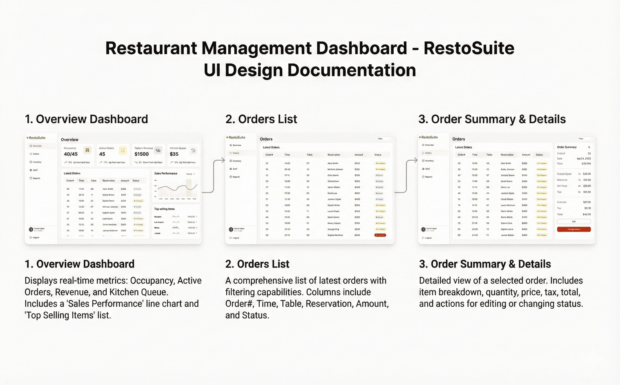
The final UI organizes information into a clear left navigation, a central orders table for scanning, and a contextual detail panel for action. Visual hierarchy, micro-interactions, and compact KPI components reduce cognitive load and speed up decision-making during service.
• Left-anchored navigation for predictable access to Overview, Orders, Inventory, Staff, and Reports.
• Dashboard KPI cards showing occupancy, active orders, revenue, and kitchen queue with short trend annotations.
• Centralized, high-density orders table optimized for quick scanning and predictable column ordering.
• Color-coded status badges (Served, In Progress, Cancelled) for immediate recognition.
• Slide-out order summary panel with full itemization, subtotal/tax/total, Edit and Change Status actions.
• Sales performance chart and top-selling items module to guide short-term operational choices.
• Consistent spacing, soft shadows, and neutral palette to balance data density with legibility.
UI DOCUMENTION:
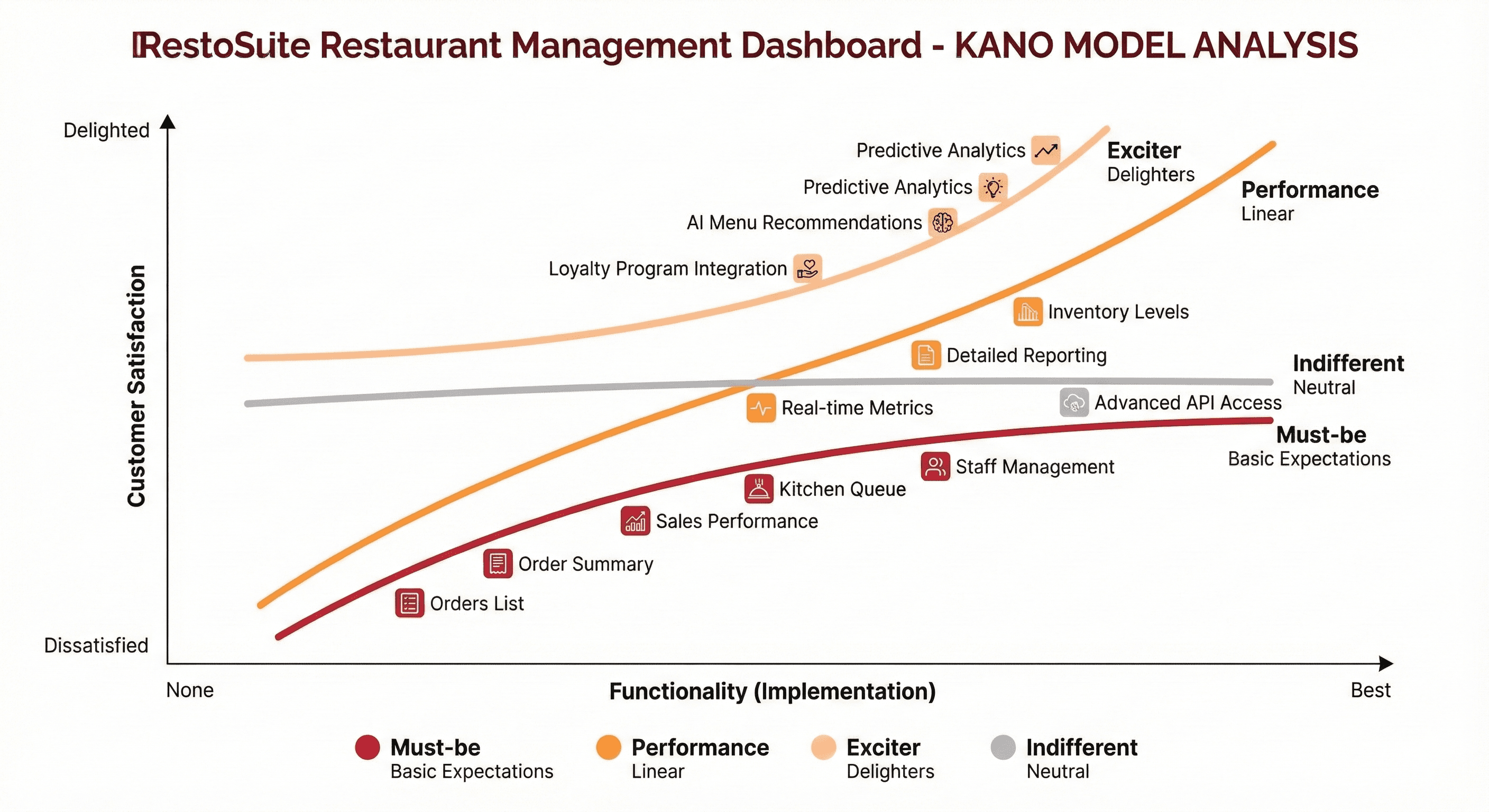
KANO MODEL:
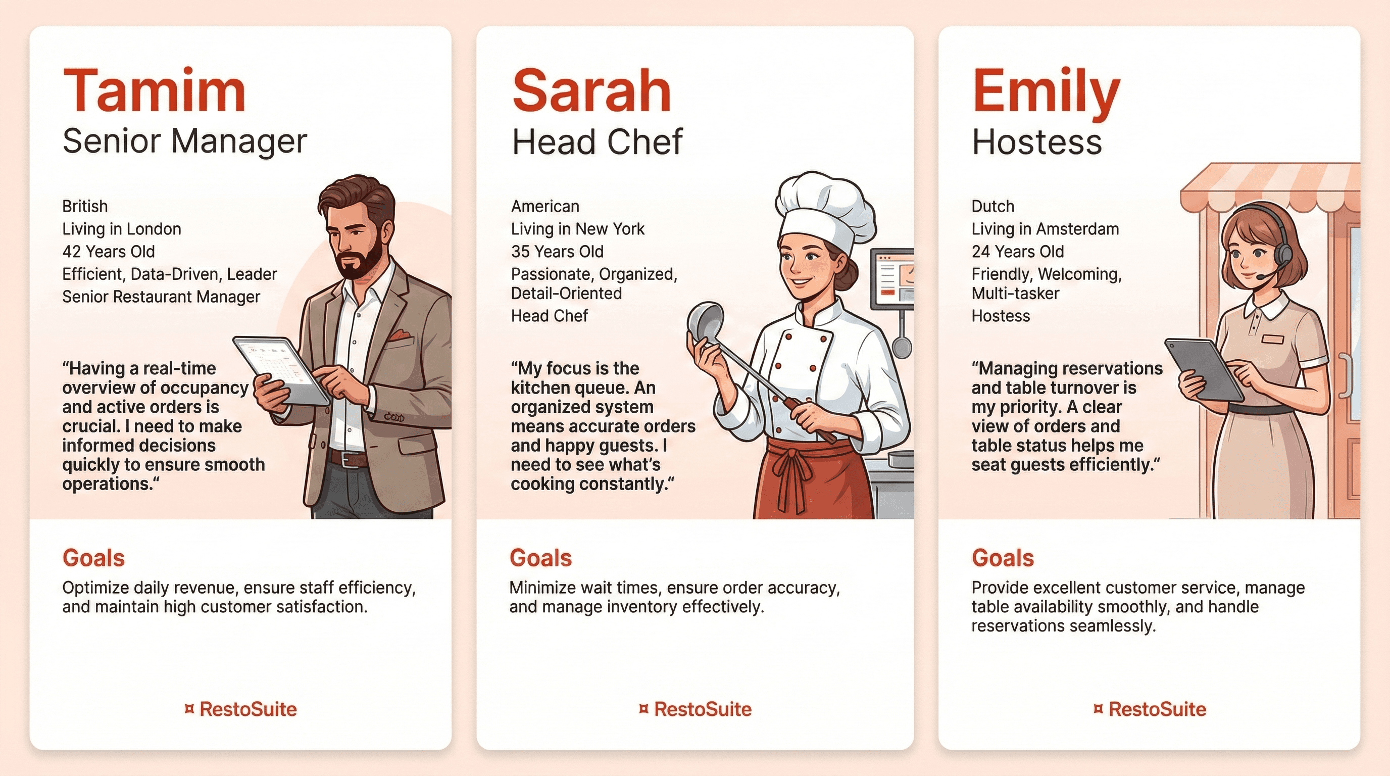
USER PERSONAS:
OUTCOME / RESULT:
• Reduced contextual switching by consolidating core operational controls into a single workspace; managers reported clearer prioritization during simulated service.
• Faster triage of order exceptions due to high-visibility status badges and the contextual order panel, lowering the likelihood of missed items.
• Improved confidence in staffing and inventory decisions from at-a-glance KPIs and the sales performance view, supporting more predictable service outcomes.
• Visual and interaction refinements made the interface approachable for non-technical staff while preserving the data richness needed by managers.
LEARNING / CONCLUSION:
• Prioritizing readable data hierarchy and predictable reading patterns materially improves decision velocity in high-pressure service environments.
• Next steps include instrumenting analytics to capture time-to-serve and status-change latency so we can convert qualitative wins into measurable improvements.
• Future iterations should explore configurable alerts and deeper role-based customizations to further reduce noise and surface only the most relevant actions per user role.

More Works
(HNS® — 02)

FAQ
01
What’s your typical workflow for new projects?
02
How do you determine project timelines?
03
Do you design for both web and mobile?
04
What are your payment terms?
05
Can I update my website or app after launch?
06
Do you only work on fixed projects, or do you offer ongoing support?
07
Can you help with branding too?
08
What file formats will I receive for design handoff?
2025
RestoSuite — DASHBOARD
A premium SaaS dashboard built for small-to-medium restaurants and multi-location operators who need clear operational visibility during service.
UI/UX
Dashboard ( SaaS)
ABOUT THE BRAND:
RestoSuite is the operating system for modern restaurants-built to streamline daily operations with clarity, precision, and control. It brings orders, inventory, staff management, and real-time reporting into one elegant, unified workspace that any restaurant can rely on.Designed for speed and consistency, RestoSuite gives owners and teams the tools to run smarter: cleaner workflows, instant insights, and a consistent connection between kitchen, floor, and management. Everything you need to operate with confidence- organized, visible, and effortlessly manageable.A premium SaaS platform crafted for restaurants that value efficiency, intelligence, and growth.
PROJECT OVERVIEW:
RestoSuite is a web-based operations dashboard designed to centralize orders, inventory, staff, and reporting for restaurants. The interface consolidates real-time KPIs, an orders table, and contextual order detail panels to reduce friction between front-of-house and kitchen workflows. Visual hierarchy and micro-interactions guide rapid decision-making for managers and shift leads.
PROJECT GOAL:
• Provide a single-screen operational view that reduces handoffs and manual coordination during peak service.
• Decrease order handling time by improving discoverability of high-priority items and statuses.
• Surface actionable KPIs and trend signals so managers can make informed staffing and inventory decisions in real time.
MY ROLE:
Product Designer
Responsible for UX strategy, information architecture, visual direction, and full UI execution. Managed the end-to-end design process, including layout systems, typography, color direction, component structure, interaction design, and content hierarchy.
THE PROBLEM:
• Operational visibility was fragmented across point-of-sale, spreadsheets, and ad-hoc notes, causing delayed responses and order mistakes.
• Managers lacked a clear, scannable dashboard showing occupancy, active orders, revenue trends, and queue backlog simultaneously.
• Order detail and status changes required multiple clicks or separate apps, increasing cognitive load for staff during service.
THE APPROACH AND PROCESS:
We defined a compact, role-focused dashboard that prioritizes glanceable information, and iterated using low-fidelity flows and stakeholder walkthroughs to validate assumptions. Emphasis was placed on table affordances, status signaling, and a contextual order panel so staff can act without leaving the screen.
• Conducted stakeholder interviews with managers and kitchen leads to map critical tasks and pain points.
• Mapped user journeys for peak and off-peak scenarios to identify required data density and controls.
• Created wireframes focusing on left-anchored navigation and a central orders table for rapid scanning.
• Designed a contextual slide-out order summary to show item-level details and quick actions.
• Built KPI cards and a sales chart to provide trend context and prompt operational decisions.
• Validated visuals and interaction patterns through in-person usability tests during service simulations.
USER INSIGHTS & KEY ACTIONS:
• Insight: Managers need immediate awareness of exceptions (delays, cancellations). Action: Introduced distinct status badges and a “Change Status” primary action in the order panel.
• Insight: Floor staff scan tables left-to-right quickly. Action: Optimized the orders table columns for predictable reading order: Order#, Time, Table, Reservation, Amount, Status.
• Insight: Revenue and queue trends inform short-term staffing. Action: Added compact KPI cards and an hourly sales chart on the dashboard.
• Insight: Item-level details are used to prep kitchen priorities. Action: Added itemized order view with subtotal, tax, and edit affordance in the panel.
WIREFRAME:
DESIGN SYSTEM:
WCAG ACCESSIBILITY DISCLAIMER:
Designed with WCAG 2.1 AA principles as a baseline. Future roadmap includes full accessibility auditing and screen-reader validation for production readiness.
THE SOLUTION:
The final UI organizes information into a clear left navigation, a central orders table for scanning, and a contextual detail panel for action. Visual hierarchy, micro-interactions, and compact KPI components reduce cognitive load and speed up decision-making during service.
• Left-anchored navigation for predictable access to Overview, Orders, Inventory, Staff, and Reports.
• Dashboard KPI cards showing occupancy, active orders, revenue, and kitchen queue with short trend annotations.
• Centralized, high-density orders table optimized for quick scanning and predictable column ordering.
• Color-coded status badges (Served, In Progress, Cancelled) for immediate recognition.
• Slide-out order summary panel with full itemization, subtotal/tax/total, Edit and Change Status actions.
• Sales performance chart and top-selling items module to guide short-term operational choices.
• Consistent spacing, soft shadows, and neutral palette to balance data density with legibility.
UI DOCUMENTION:
KANO MODEL:
USER PERSONAS:
OUTCOME / RESULT:
• Reduced contextual switching by consolidating core operational controls into a single workspace; managers reported clearer prioritization during simulated service.
• Faster triage of order exceptions due to high-visibility status badges and the contextual order panel, lowering the likelihood of missed items.
• Improved confidence in staffing and inventory decisions from at-a-glance KPIs and the sales performance view, supporting more predictable service outcomes.
• Visual and interaction refinements made the interface approachable for non-technical staff while preserving the data richness needed by managers.
LEARNING / CONCLUSION:
• Prioritizing readable data hierarchy and predictable reading patterns materially improves decision velocity in high-pressure service environments.
• Next steps include instrumenting analytics to capture time-to-serve and status-change latency so we can convert qualitative wins into measurable improvements.
• Future iterations should explore configurable alerts and deeper role-based customizations to further reduce noise and surface only the most relevant actions per user role.
More Works
(HNS® — 02)
FAQ
01
What’s your typical workflow for new projects?
02
How do you determine project timelines?
03
Do you design for both web and mobile?
04
What are your payment terms?
05
Can I update my website or app after launch?
06
Do you only work on fixed projects, or do you offer ongoing support?
07
Can you help with branding too?
08
What file formats will I receive for design handoff?
2025
RestoSuite — DASHBOARD
A premium SaaS dashboard built for small-to-medium restaurants and multi-location operators who need clear operational visibility during service.
UI/UX
Dashboard ( SaaS)
ABOUT THE BRAND:
RestoSuite is the operating system for modern restaurants-built to streamline daily operations with clarity, precision, and control. It brings orders, inventory, staff management, and real-time reporting into one elegant, unified workspace that any restaurant can rely on.Designed for speed and consistency, RestoSuite gives owners and teams the tools to run smarter: cleaner workflows, instant insights, and a consistent connection between kitchen, floor, and management. Everything you need to operate with confidence- organized, visible, and effortlessly manageable.A premium SaaS platform crafted for restaurants that value efficiency, intelligence, and growth.
PROJECT OVERVIEW:
RestoSuite is a web-based operations dashboard designed to centralize orders, inventory, staff, and reporting for restaurants. The interface consolidates real-time KPIs, an orders table, and contextual order detail panels to reduce friction between front-of-house and kitchen workflows. Visual hierarchy and micro-interactions guide rapid decision-making for managers and shift leads.
PROJECT GOAL:
• Provide a single-screen operational view that reduces handoffs and manual coordination during peak service.
• Decrease order handling time by improving discoverability of high-priority items and statuses.
• Surface actionable KPIs and trend signals so managers can make informed staffing and inventory decisions in real time.
MY ROLE:
Product Designer
Responsible for UX strategy, information architecture, visual direction, and full UI execution. Managed the end-to-end design process, including layout systems, typography, color direction, component structure, interaction design, and content hierarchy.
THE PROBLEM:
• Operational visibility was fragmented across point-of-sale, spreadsheets, and ad-hoc notes, causing delayed responses and order mistakes.
• Managers lacked a clear, scannable dashboard showing occupancy, active orders, revenue trends, and queue backlog simultaneously.
• Order detail and status changes required multiple clicks or separate apps, increasing cognitive load for staff during service.
THE APPROACH AND PROCESS:
We defined a compact, role-focused dashboard that prioritizes glanceable information, and iterated using low-fidelity flows and stakeholder walkthroughs to validate assumptions. Emphasis was placed on table affordances, status signaling, and a contextual order panel so staff can act without leaving the screen.
• Conducted stakeholder interviews with managers and kitchen leads to map critical tasks and pain points.
• Mapped user journeys for peak and off-peak scenarios to identify required data density and controls.
• Created wireframes focusing on left-anchored navigation and a central orders table for rapid scanning.
• Designed a contextual slide-out order summary to show item-level details and quick actions.
• Built KPI cards and a sales chart to provide trend context and prompt operational decisions.
• Validated visuals and interaction patterns through in-person usability tests during service simulations.
USER INSIGHTS & KEY ACTIONS:
• Insight: Managers need immediate awareness of exceptions (delays, cancellations). Action: Introduced distinct status badges and a “Change Status” primary action in the order panel.
• Insight: Floor staff scan tables left-to-right quickly. Action: Optimized the orders table columns for predictable reading order: Order#, Time, Table, Reservation, Amount, Status.
• Insight: Revenue and queue trends inform short-term staffing. Action: Added compact KPI cards and an hourly sales chart on the dashboard.
• Insight: Item-level details are used to prep kitchen priorities. Action: Added itemized order view with subtotal, tax, and edit affordance in the panel.
WIREFRAME:
DESIGN SYSTEM:
WCAG ACCESSIBILITY DISCLAIMER:
Designed with WCAG 2.1 AA principles as a baseline. Future roadmap includes full accessibility auditing and screen-reader validation for production readiness.
THE SOLUTION:
The final UI organizes information into a clear left navigation, a central orders table for scanning, and a contextual detail panel for action. Visual hierarchy, micro-interactions, and compact KPI components reduce cognitive load and speed up decision-making during service.
• Left-anchored navigation for predictable access to Overview, Orders, Inventory, Staff, and Reports.
• Dashboard KPI cards showing occupancy, active orders, revenue, and kitchen queue with short trend annotations.
• Centralized, high-density orders table optimized for quick scanning and predictable column ordering.
• Color-coded status badges (Served, In Progress, Cancelled) for immediate recognition.
• Slide-out order summary panel with full itemization, subtotal/tax/total, Edit and Change Status actions.
• Sales performance chart and top-selling items module to guide short-term operational choices.
• Consistent spacing, soft shadows, and neutral palette to balance data density with legibility.
UI DOCUMENTION:
KANO MODEL:
USER PERSONAS:
OUTCOME / RESULT:
• Reduced contextual switching by consolidating core operational controls into a single workspace; managers reported clearer prioritization during simulated service.
• Faster triage of order exceptions due to high-visibility status badges and the contextual order panel, lowering the likelihood of missed items.
• Improved confidence in staffing and inventory decisions from at-a-glance KPIs and the sales performance view, supporting more predictable service outcomes.
• Visual and interaction refinements made the interface approachable for non-technical staff while preserving the data richness needed by managers.
LEARNING / CONCLUSION:
• Prioritizing readable data hierarchy and predictable reading patterns materially improves decision velocity in high-pressure service environments.
• Next steps include instrumenting analytics to capture time-to-serve and status-change latency so we can convert qualitative wins into measurable improvements.
• Future iterations should explore configurable alerts and deeper role-based customizations to further reduce noise and surface only the most relevant actions per user role.
More Works
FAQ
What’s your typical workflow for new projects?
How do you determine project timelines?
Do you design for both web and mobile?
What are your payment terms?
Can I update my website or app after launch?
Do you only work on fixed projects, or do you offer ongoing support?
Can you help with branding too?
What file formats will I receive for design handoff?