2025
TakaLink
TakaLink is a Bangladesh-focused fintech platform offering secure transfers, real-time tracking, and smart financial analytics for individuals, freelancers, and businesses.
UI/UX
WEB DESIGN
About the Brand
TakaLink is a fintech ecosystem built for Bangladesh, offering secure cross-border transfers, smart money management, and real-time financial analytics. The brand focuses on trust, speed, and clarity, enabling individuals, freelancers, and businesses to manage money confidently.
Project Overview
The project involved designing TakaLink’s official marketing website from scratch. The goal was to create a high-credibility digital presence that explains the product clearly, builds trust instantly, and drives users toward app downloads and demo requests.The website needed to communicate complex fintech operations through simple, intuitive storytelling.
Project Goal
Primary Goals:
• Build a conversion-focused site that increases app downloads and demo sign-ups.
• Communicate TakaLink’s value proposition with clarity for both individuals and businesses.
• Establish strong brand trust using metrics, social proof, and real UI previews.
Secondary Goals:
• Create a scalable web structure for future product expansions.
• Maintain a design system consistent with the app’s visual identity.
• Reduce cognitive load for new users learning unfamiliar fintech features.
MY ROLE:
Product Designer
• Conducted research, user understanding, and competitive review
• Mapped the website IA and content architecture
• Designed layout, UI components, iconography, and interaction patterns
• Created high-fidelity visuals, responsive behavior, and presentational animations
• Ensured brand continuity across hero, features, flows, FAQ, and footer
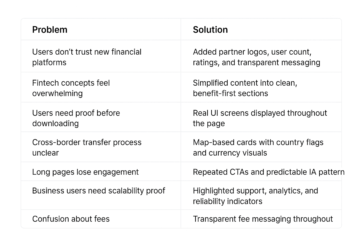
The Challenge & Wireframing
• Fintech is trust-sensitive, so the site needed instant confidence building
• Explain cross-border transfers, analytics, and multi-currency features without jargon
• Visually balance a data-heavy product with an accessible interface
• Maintain consistency between light website visuals and dark app UI
• Align with business goals while simplifying feature overload
USER INSIGHTS :
Insights were gathered from early adopters, fintech users in Bangladesh, and market observations.
• Users need fee transparency before trusting a new financial service
• Reliability during international transfers is the top concern
• People judge fintech brands heavily by first-impression credibility
• Users respond better to real UI elements than abstract illustrations
• Business users want scalability, analytics, and customer support clarity
• A large part of the audience seeks an app that "just works" without friction
THE APPROACH & PROCESS
1.Research & Benchmarking:
Analyzed global fintech sites to identify common trust-building patterns:
hero clarity, social proof early, feature explanation after.
2.Information Architecture:
Structured the site into a simple, predictable vertical flow:
Hero → Social Proof → Features → App UI → FAQ → Conversion Footer.
3.Content Strategy:
• Short, direct copy to avoid fintech fatigue
• Benefit-first messaging
• Transparency emphasized in multiple sections
4.Visual Direction:
• White background for clarity; neon accents for brand identity
• Grid-based sections to maintain rhythm
• Floating UI cards to show real functionality
• Clean icons to reinforce comprehension
Proposed Solution
A structured, trust-driven fintech website designed with clarity and visual proof at its core.
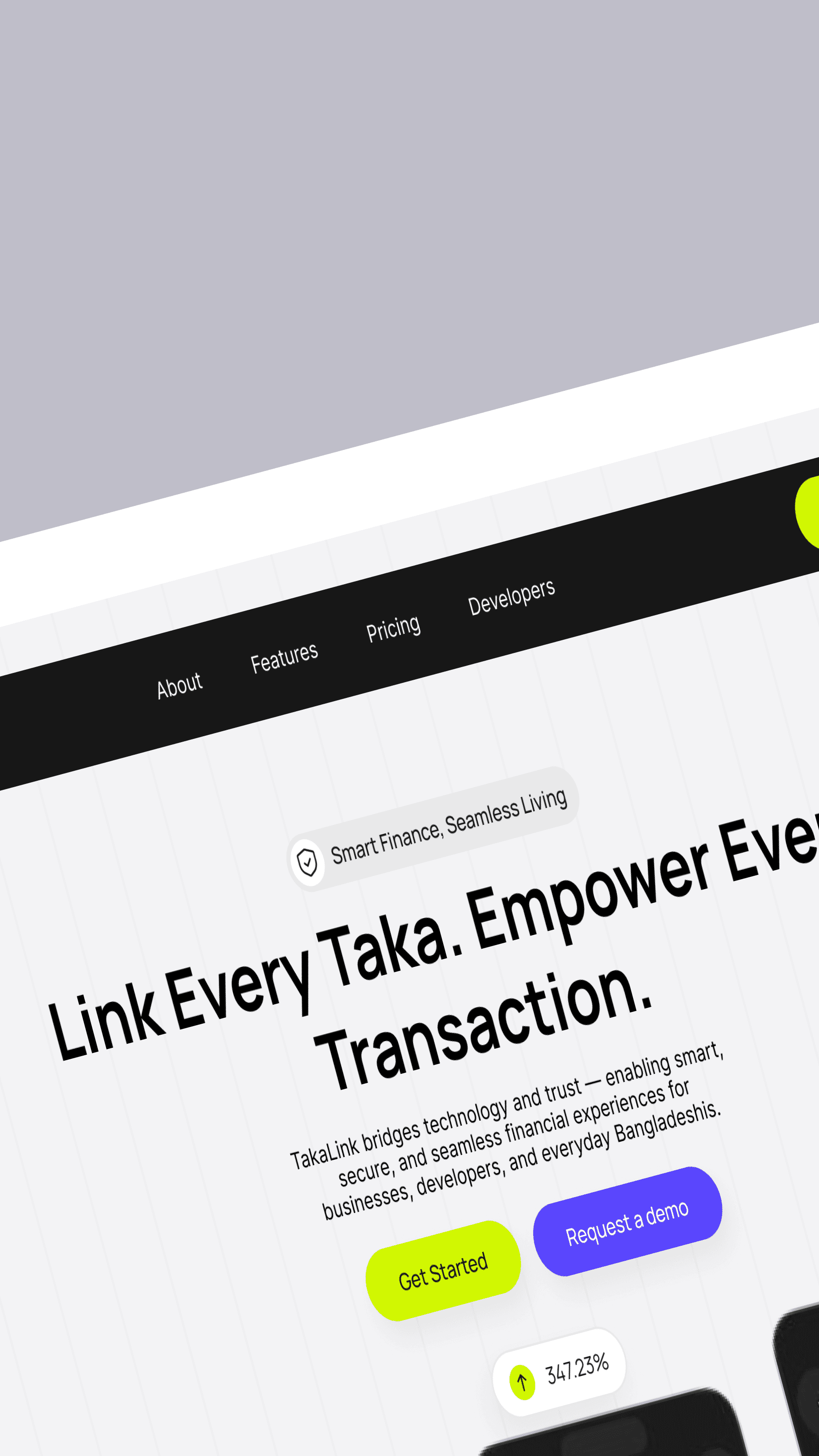
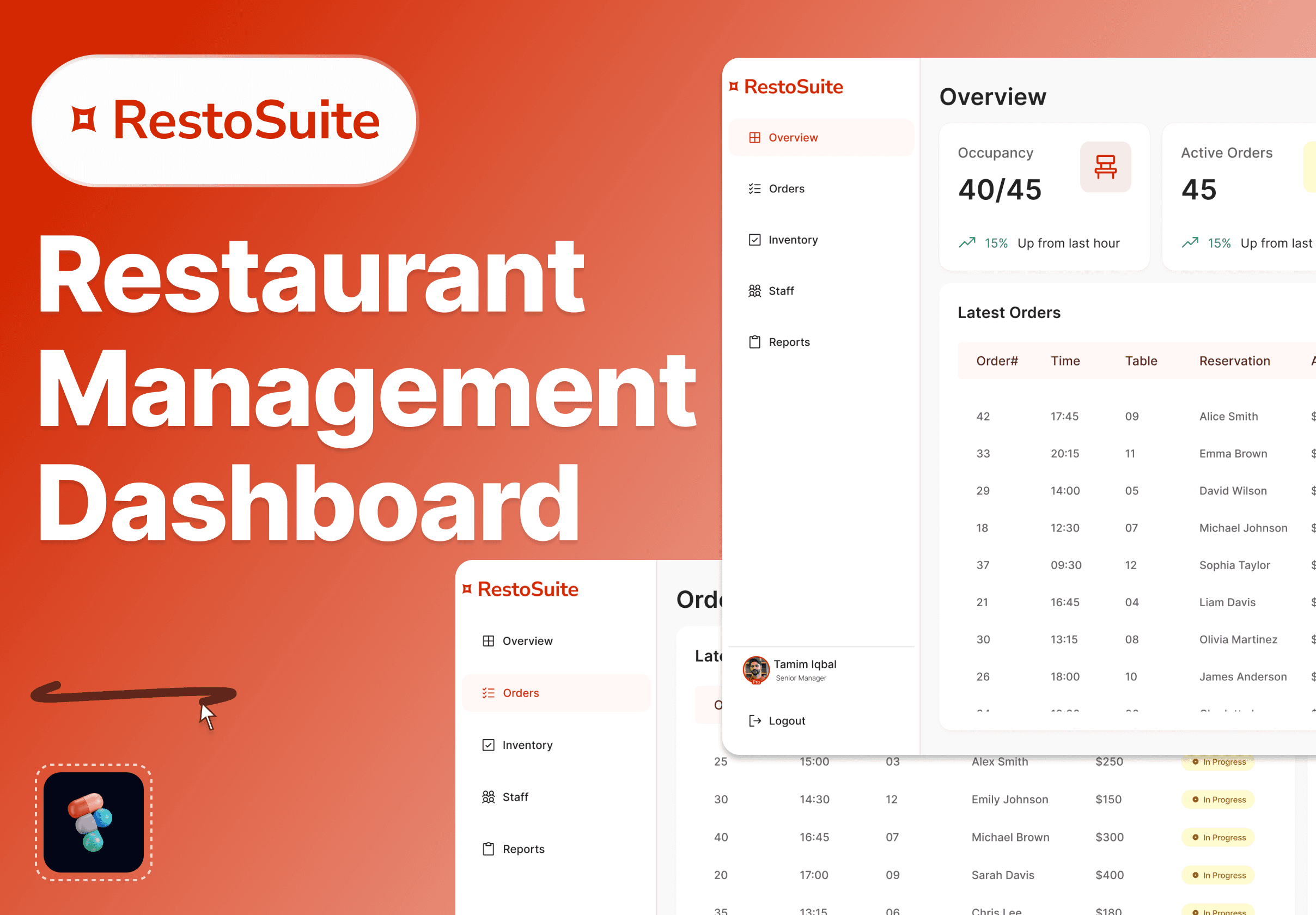
• Strong hero section with international transfer UI cards
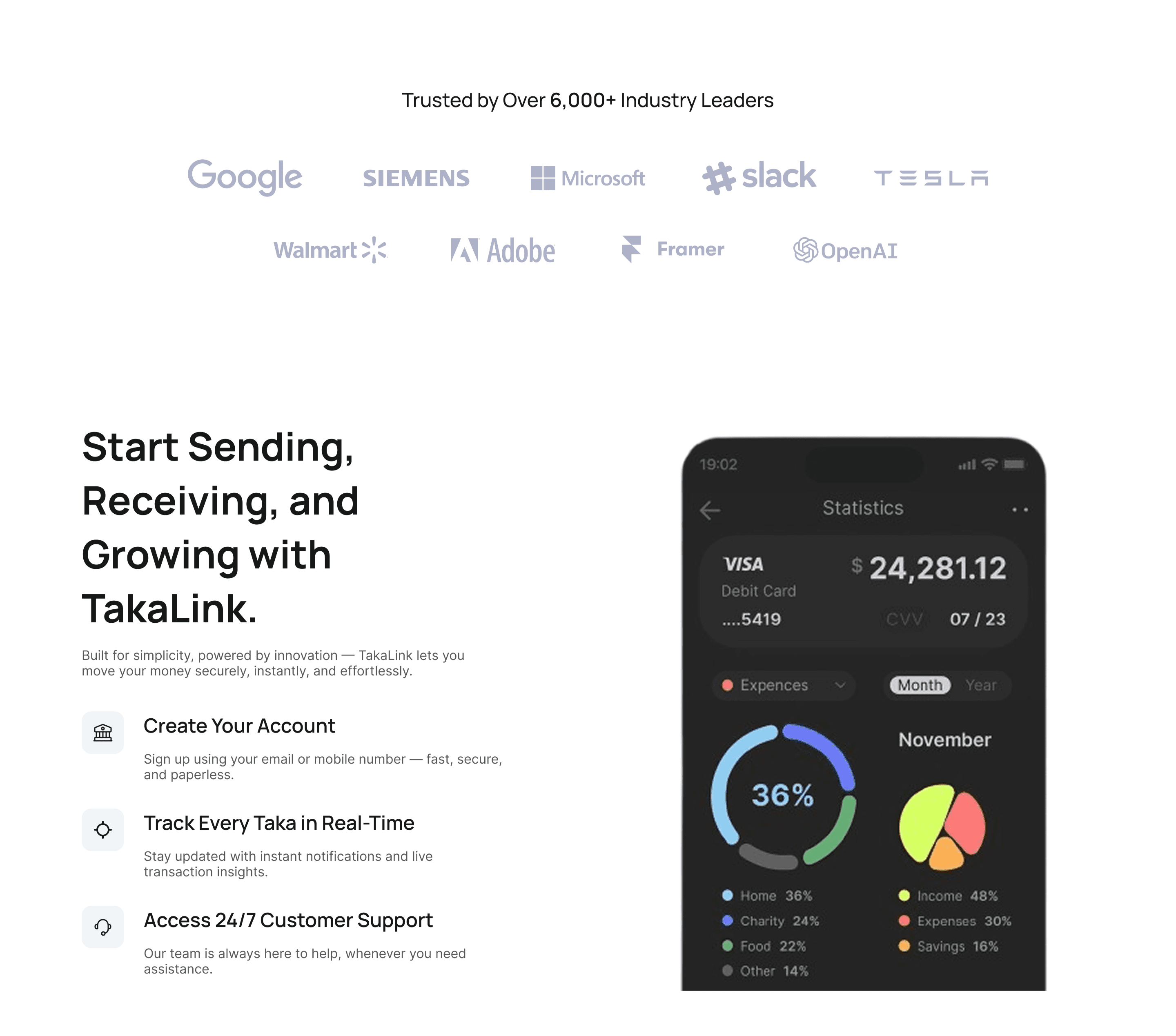
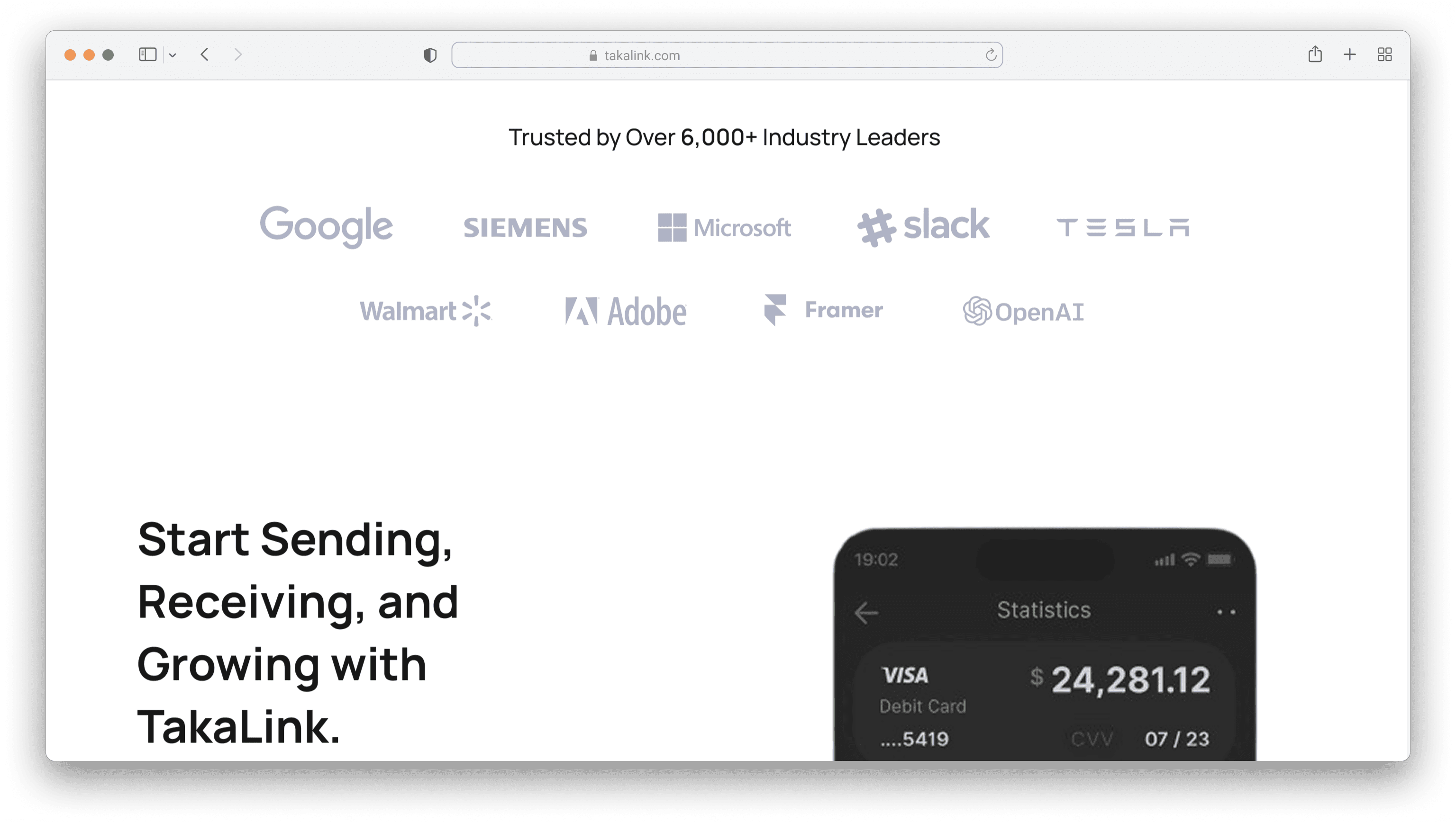
• Social proof carousel of 6,000+ recognized partners
• Feature blocks showing onboarding, tracking, and support
• Data visualizations and analytics cards taken from real app UI
• Transaction list to show payment transparency
• Modern FAQ system for pre-conversion reassurance
• High-impact footer encouraging app downloads
• Unified design language across all sections
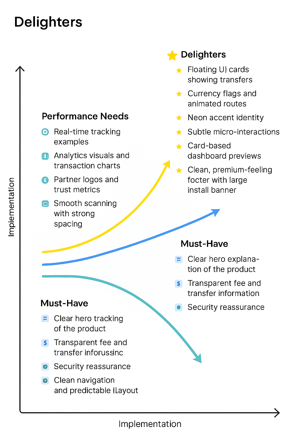
KANO MODEL:
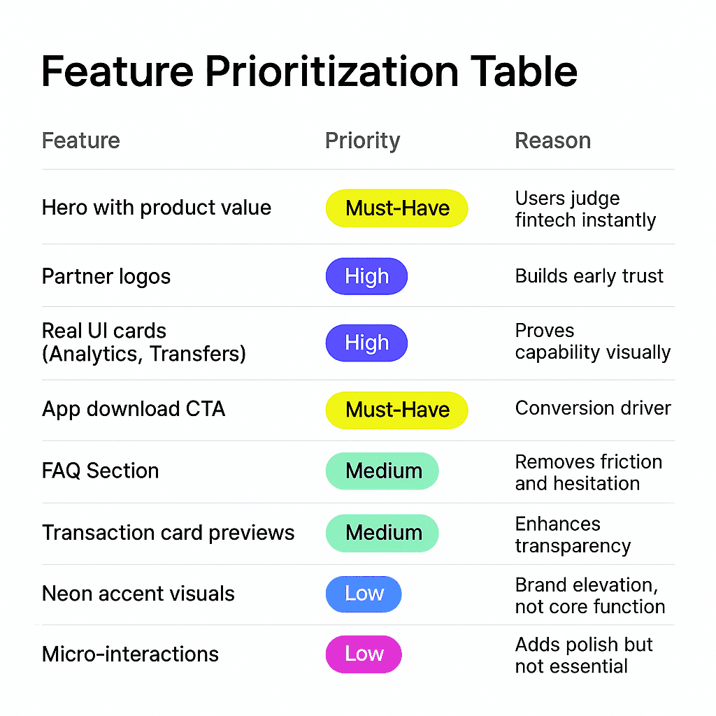
FEATURE PRIORITIZATION:
OUTCOMES:
• Strong brand perception through clean layout and metrics
• Easier comprehension of fintech features
• Improved conversion intent through repeated CTAs and trust content
LEARNINGS:
• UI-driven storytelling works best for fintech
• Trust elements dramatically improve engagement
• Simple hierarchy reduces cognitive load for new fintech users
More Works
(HNS® — 02)

FAQ
01
What’s your typical workflow for new projects?
02
How do you determine project timelines?
03
Do you design for both web and mobile?
04
What are your payment terms?
05
Can I update my website or app after launch?
06
Do you only work on fixed projects, or do you offer ongoing support?
07
Can you help with branding too?
08
What file formats will I receive for design handoff?
2025
TakaLink
TakaLink is a Bangladesh-focused fintech platform offering secure transfers, real-time tracking, and smart financial analytics for individuals, freelancers, and businesses.
UI/UX
WEB DESIGN
About the Brand
TakaLink is a fintech ecosystem built for Bangladesh, offering secure cross-border transfers, smart money management, and real-time financial analytics. The brand focuses on trust, speed, and clarity, enabling individuals, freelancers, and businesses to manage money confidently.
Project Overview
The project involved designing TakaLink’s official marketing website from scratch. The goal was to create a high-credibility digital presence that explains the product clearly, builds trust instantly, and drives users toward app downloads and demo requests.The website needed to communicate complex fintech operations through simple, intuitive storytelling.
Project Goal
Primary Goals:
• Build a conversion-focused site that increases app downloads and demo sign-ups.
• Communicate TakaLink’s value proposition with clarity for both individuals and businesses.
• Establish strong brand trust using metrics, social proof, and real UI previews.
Secondary Goals:
• Create a scalable web structure for future product expansions.
• Maintain a design system consistent with the app’s visual identity.
• Reduce cognitive load for new users learning unfamiliar fintech features.
MY ROLE:
Product Designer
• Conducted research, user understanding, and competitive review
• Mapped the website IA and content architecture
• Designed layout, UI components, iconography, and interaction patterns
• Created high-fidelity visuals, responsive behavior, and presentational animations
• Ensured brand continuity across hero, features, flows, FAQ, and footer
The Challenge & Wireframing
• Fintech is trust-sensitive, so the site needed instant confidence building
• Explain cross-border transfers, analytics, and multi-currency features without jargon
• Visually balance a data-heavy product with an accessible interface
• Maintain consistency between light website visuals and dark app UI
• Align with business goals while simplifying feature overload
USER INSIGHTS :
Insights were gathered from early adopters, fintech users in Bangladesh, and market observations.
• Users need fee transparency before trusting a new financial service
• Reliability during international transfers is the top concern
• People judge fintech brands heavily by first-impression credibility
• Users respond better to real UI elements than abstract illustrations
• Business users want scalability, analytics, and customer support clarity
• A large part of the audience seeks an app that "just works" without friction
THE APPROACH & PROCESS
1.Research & Benchmarking:
Analyzed global fintech sites to identify common trust-building patterns:
hero clarity, social proof early, feature explanation after.
2.Information Architecture:
Structured the site into a simple, predictable vertical flow:
Hero → Social Proof → Features → App UI → FAQ → Conversion Footer.
3.Content Strategy:
• Short, direct copy to avoid fintech fatigue
• Benefit-first messaging
• Transparency emphasized in multiple sections
4.Visual Direction:
• White background for clarity; neon accents for brand identity
• Grid-based sections to maintain rhythm
• Floating UI cards to show real functionality
• Clean icons to reinforce comprehension
Proposed Solution
A structured, trust-driven fintech website designed with clarity and visual proof at its core.
• Strong hero section with international transfer UI cards
• Social proof carousel of 6,000+ recognized partners
• Feature blocks showing onboarding, tracking, and support
• Data visualizations and analytics cards taken from real app UI
• Transaction list to show payment transparency
• Modern FAQ system for pre-conversion reassurance
• High-impact footer encouraging app downloads
• Unified design language across all sections
KANO MODEL:
FEATURE PRIORITIZATION:
OUTCOMES:
• Strong brand perception through clean layout and metrics
• Easier comprehension of fintech features
• Improved conversion intent through repeated CTAs and trust content
LEARNINGS:
• UI-driven storytelling works best for fintech
• Trust elements dramatically improve engagement
• Simple hierarchy reduces cognitive load for new fintech users
More Works
(HNS® — 02)
FAQ
01
What’s your typical workflow for new projects?
02
How do you determine project timelines?
03
Do you design for both web and mobile?
04
What are your payment terms?
05
Can I update my website or app after launch?
06
Do you only work on fixed projects, or do you offer ongoing support?
07
Can you help with branding too?
08
What file formats will I receive for design handoff?
2025
TakaLink
TakaLink is a Bangladesh-focused fintech platform offering secure transfers, real-time tracking, and smart financial analytics for individuals, freelancers, and businesses.
UI/UX
WEB DESIGN
About the Brand
TakaLink is a fintech ecosystem built for Bangladesh, offering secure cross-border transfers, smart money management, and real-time financial analytics. The brand focuses on trust, speed, and clarity, enabling individuals, freelancers, and businesses to manage money confidently.
Project Overview
The project involved designing TakaLink’s official marketing website from scratch. The goal was to create a high-credibility digital presence that explains the product clearly, builds trust instantly, and drives users toward app downloads and demo requests.The website needed to communicate complex fintech operations through simple, intuitive storytelling.
Project Goal
Primary Goals:
• Build a conversion-focused site that increases app downloads and demo sign-ups.
• Communicate TakaLink’s value proposition with clarity for both individuals and businesses.
• Establish strong brand trust using metrics, social proof, and real UI previews.
Secondary Goals:
• Create a scalable web structure for future product expansions.
• Maintain a design system consistent with the app’s visual identity.
• Reduce cognitive load for new users learning unfamiliar fintech features.
MY ROLE:
Product Designer
• Conducted research, user understanding, and competitive review
• Mapped the website IA and content architecture
• Designed layout, UI components, iconography, and interaction patterns
• Created high-fidelity visuals, responsive behavior, and presentational animations
• Ensured brand continuity across hero, features, flows, FAQ, and footer
The Challenge & Wireframing
• Fintech is trust-sensitive, so the site needed instant confidence building
• Explain cross-border transfers, analytics, and multi-currency features without jargon
• Visually balance a data-heavy product with an accessible interface
• Maintain consistency between light website visuals and dark app UI
• Align with business goals while simplifying feature overload
USER INSIGHTS :
Insights were gathered from early adopters, fintech users in Bangladesh, and market observations.
• Users need fee transparency before trusting a new financial service
• Reliability during international transfers is the top concern
• People judge fintech brands heavily by first-impression credibility
• Users respond better to real UI elements than abstract illustrations
• Business users want scalability, analytics, and customer support clarity
• A large part of the audience seeks an app that "just works" without friction
THE APPROACH & PROCESS
1.Research & Benchmarking:
Analyzed global fintech sites to identify common trust-building patterns:
hero clarity, social proof early, feature explanation after.
2.Information Architecture:
Structured the site into a simple, predictable vertical flow:
Hero → Social Proof → Features → App UI → FAQ → Conversion Footer.
3.Content Strategy:
• Short, direct copy to avoid fintech fatigue
• Benefit-first messaging
• Transparency emphasized in multiple sections
4.Visual Direction:
• White background for clarity; neon accents for brand identity
• Grid-based sections to maintain rhythm
• Floating UI cards to show real functionality
• Clean icons to reinforce comprehension
Proposed Solution
A structured, trust-driven fintech website designed with clarity and visual proof at its core.
• Strong hero section with international transfer UI cards
• Social proof carousel of 6,000+ recognized partners
• Feature blocks showing onboarding, tracking, and support
• Data visualizations and analytics cards taken from real app UI
• Transaction list to show payment transparency
• Modern FAQ system for pre-conversion reassurance
• High-impact footer encouraging app downloads
• Unified design language across all sections
KANO MODEL:
FEATURE PRIORITIZATION:
OUTCOMES:
• Strong brand perception through clean layout and metrics
• Easier comprehension of fintech features
• Improved conversion intent through repeated CTAs and trust content
LEARNINGS:
• UI-driven storytelling works best for fintech
• Trust elements dramatically improve engagement
• Simple hierarchy reduces cognitive load for new fintech users
More Works
FAQ
What’s your typical workflow for new projects?
How do you determine project timelines?
Do you design for both web and mobile?
What are your payment terms?
Can I update my website or app after launch?
Do you only work on fixed projects, or do you offer ongoing support?
Can you help with branding too?
What file formats will I receive for design handoff?