
ABOUT THE BRAND:
Wellington Legal positions itself as a legacy-driven law firm with over two decades of expertise across corporate, civil, and family legal services. The brand identity requires sophistication, credibility, and restraint, supported by minimal typography, deliberate spacing, and photography that reinforces professionalism. The website serves as a core touchpoint for establishing trust and encouraging prospective clients to engage with the firm.
PROJECT OVERVIEW:
This project focused on creating a premium digital presence for Wellington Legal, a law firm emphasizing heritage, authority, and contemporary legal expertise. The goal was to design a complete website interface that communicates trust, professionalism, and clarity while guiding potential clients toward consultation and case evaluation services. The site needed a strong visual hierarchy, accessible information architecture, and a modern brand expression aligned with the firm’s reputation.

PROJECT GOAL:
The objective was to create a complete website UI system that communicates authority while remaining intuitive for users seeking legal support. The design needed to highlight the firm's experience, showcase service categories, and make attorney profiles easily discoverable. A seamless path from information gathering to consultation booking was essential.
MY ROLE:
Product Designer
Responsible for UX strategy, information architecture, visual direction, and full UI execution. Managed the end-to-end design process, including layout systems, typography, color direction, component structure, interaction design, and content hierarchy. Ensured the final interface aligned with the firm’s brand values and communicated professionalism and trustworthiness across all touchpoints.


THE PROBLEM
Despite two decades of offline success, Wellington Legal suffered from a "digital trust gap." Without an online presence, prospective clients had no way to verify the firm’s expertise, attorney credentials, or service scope before reaching out.
The challenge was to build a foundational platform (0-to-1) that could translate their physical reputation into a digital experience, establishing instant authority and removing hesitation for high-stakes clients.
Trust Translation: Converting 20 years of legacy into an intuitive UI.
Information Void: Users lacked critical decision-making data (Pricing, Expertise).
Credibility Risk: "Invisible" firms are perceived as outdated or risky by modern clients.
THE APPROACH AND PROCESS:
The design process prioritized clarity, emotional trust-building, and organized discovery paths for users who may be stressed or time-constrained. The approach used a content-first structure, enabling each section to reinforce expertise while supporting conversion-oriented navigation.
• Defined a clear content hierarchy based on user intent: learn about the firm, explore services, evaluate attorneys, review pricing, and initiate contact.
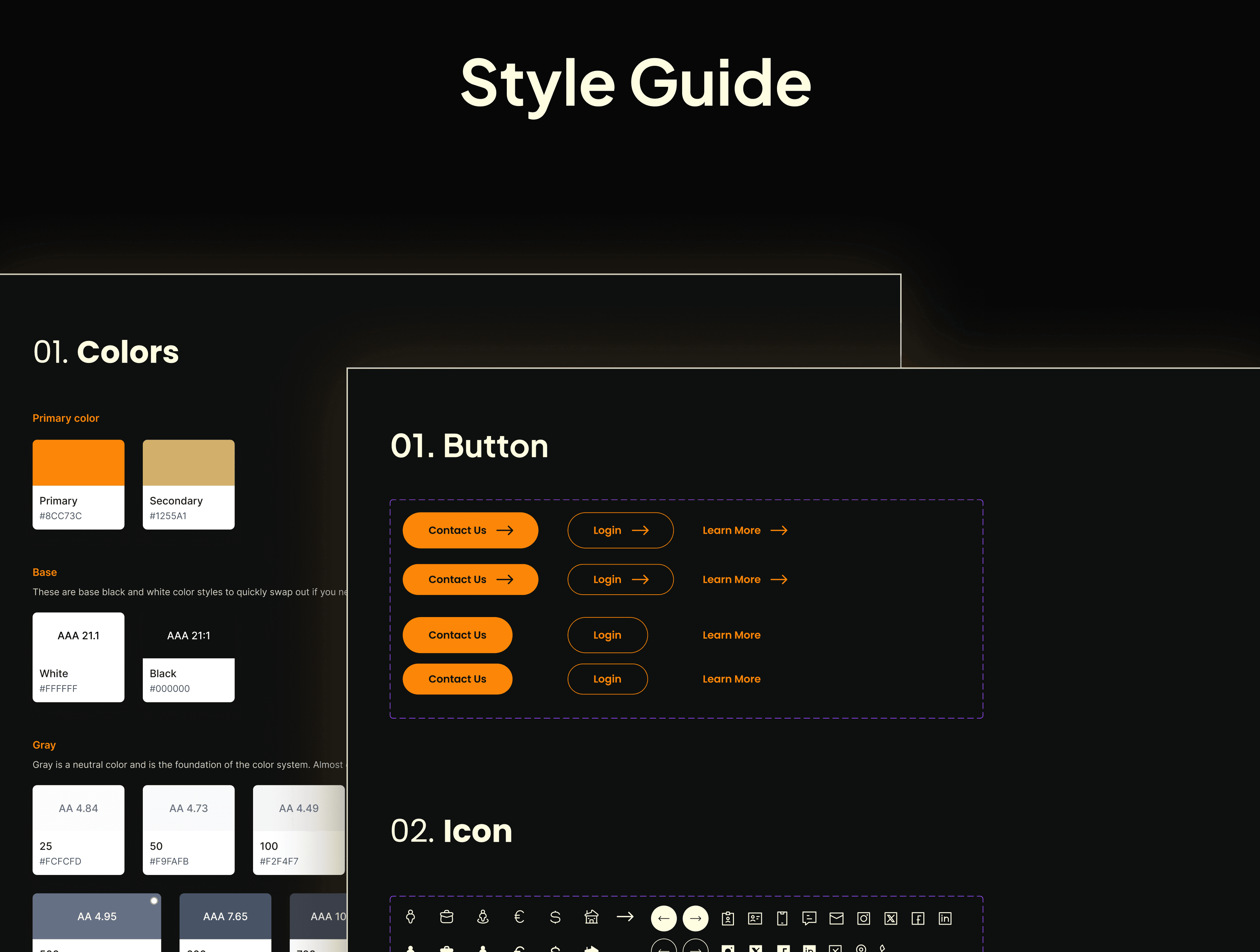
• Developed a refined visual language using dark surfaces and golden accents to communicate tradition and confidence.
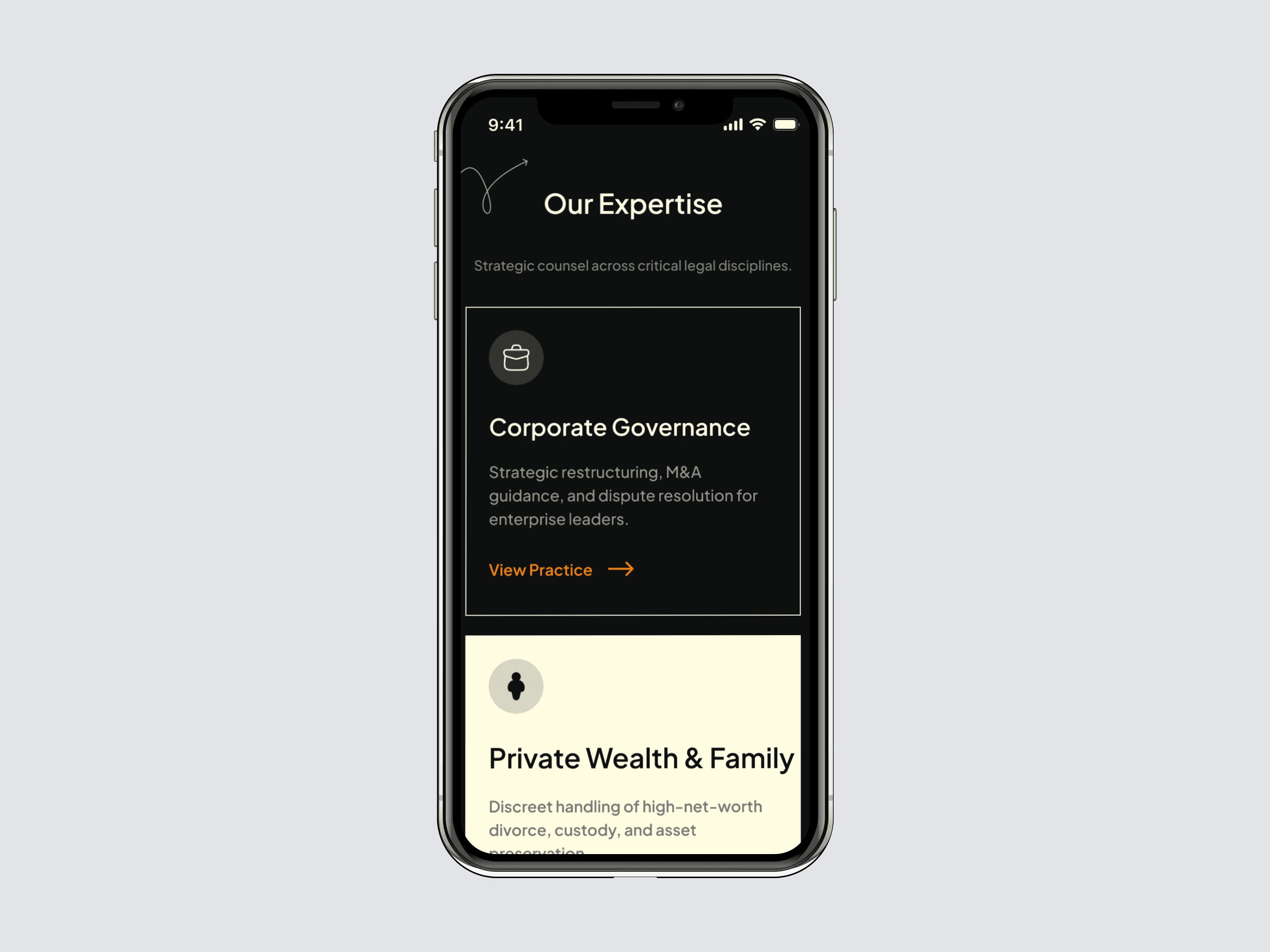
• Structured service categories and practice areas with concise microcopy to reduce cognitive load.
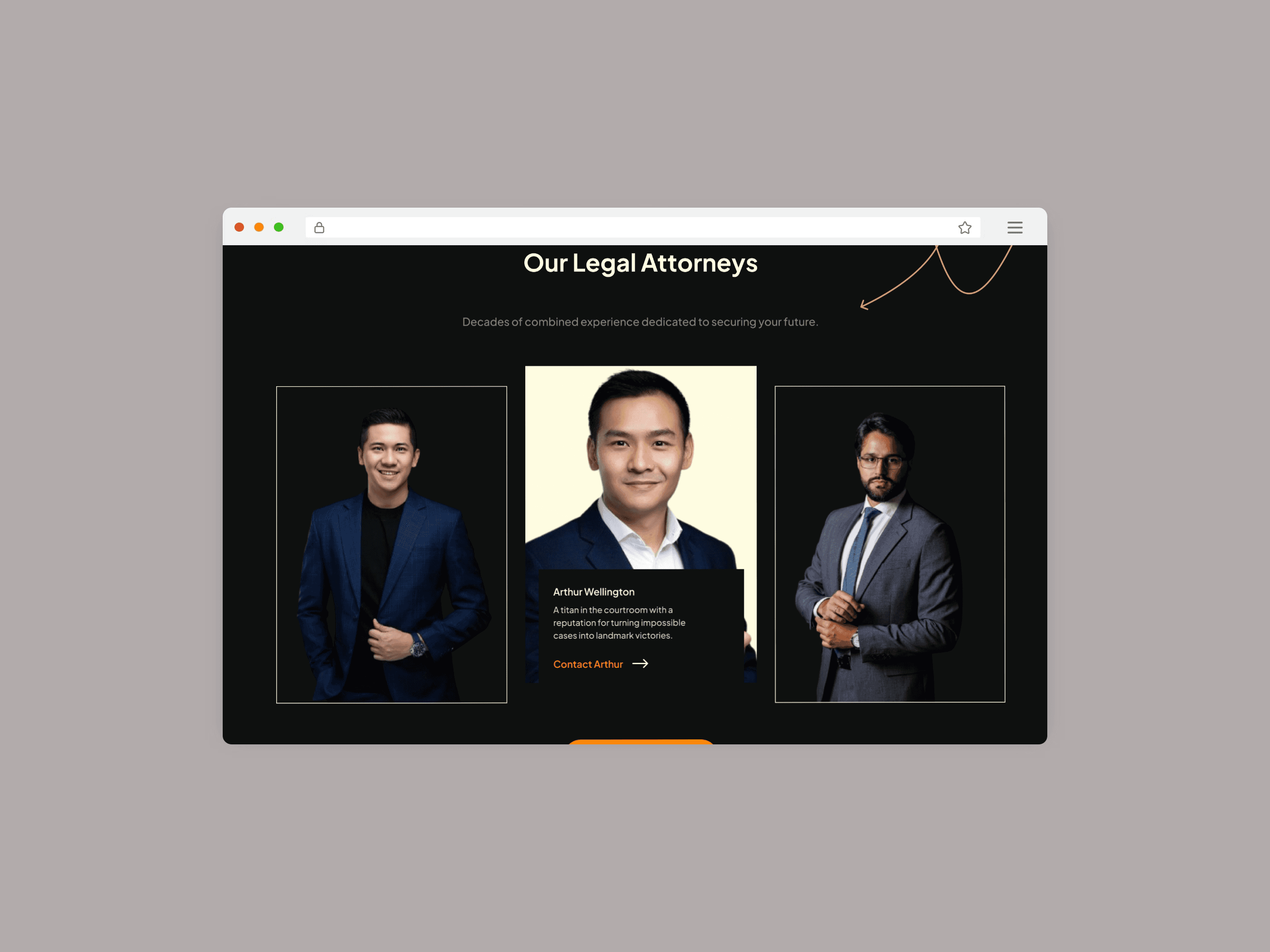
• Designed attorney spotlight cards with portrait photography to humanize the firm.
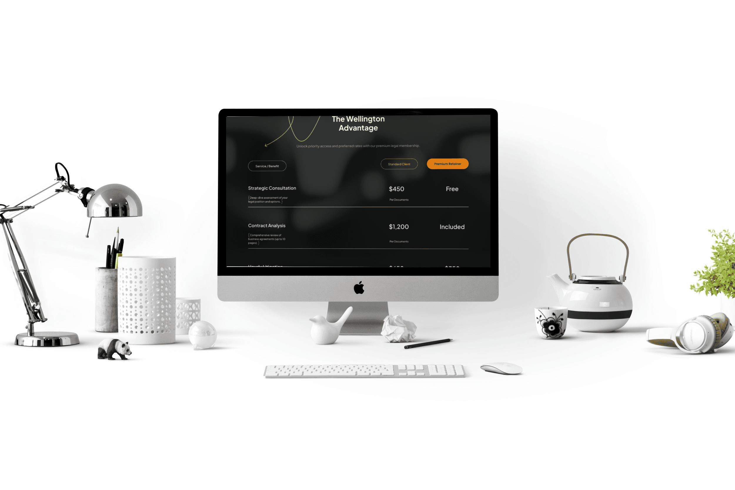
• Added transparent pricing tables to help users understand service tiers without ambiguity.
• Implemented persuasive elements such as testimonials, industry trust badges, and recognition logos.
• Designed lead-generation modules including contact forms and case evaluation requests.
• Ensured consistent spacing, alignment, and typography for legibility across the interface.
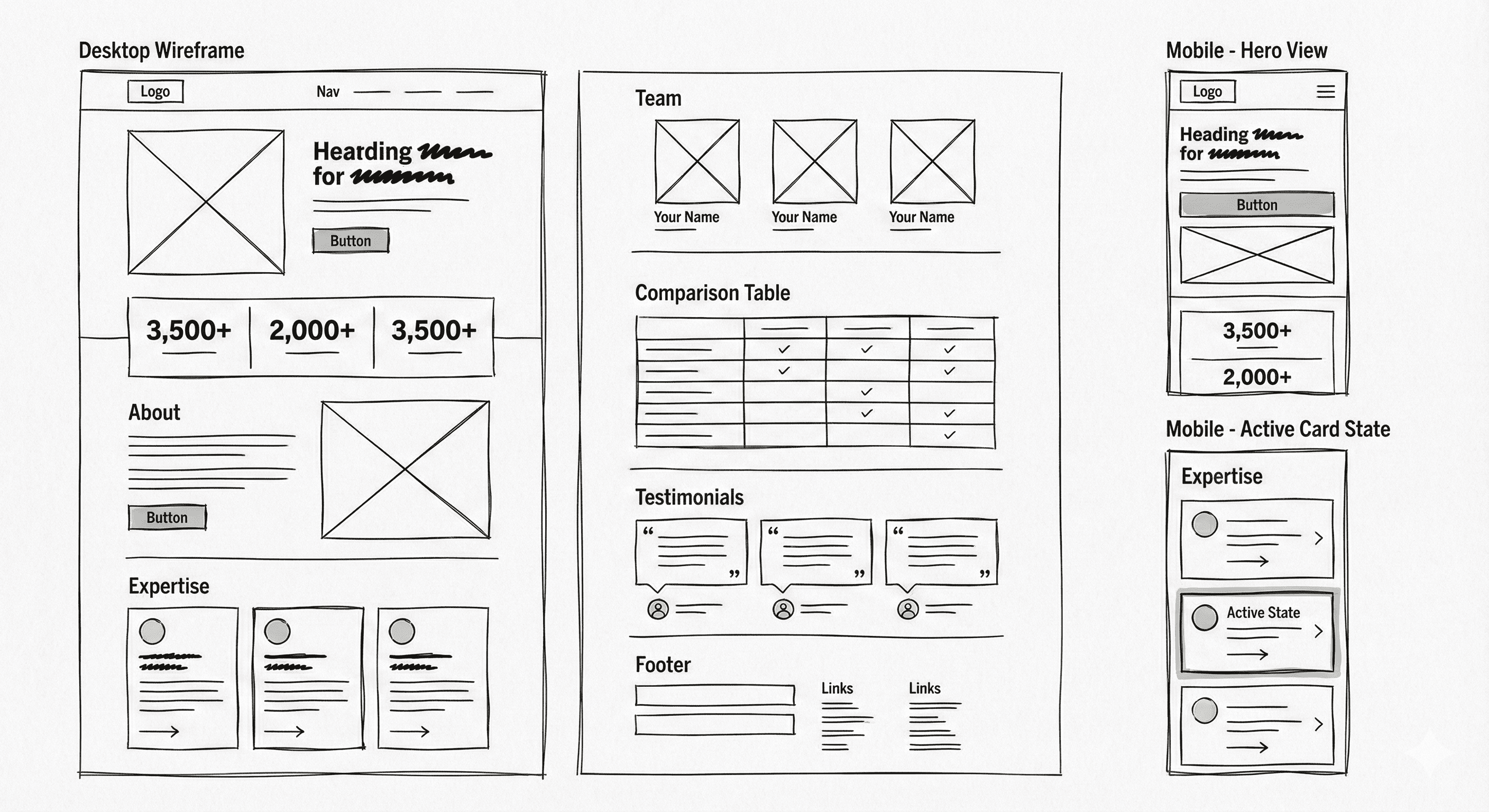
WIREFRAMING:
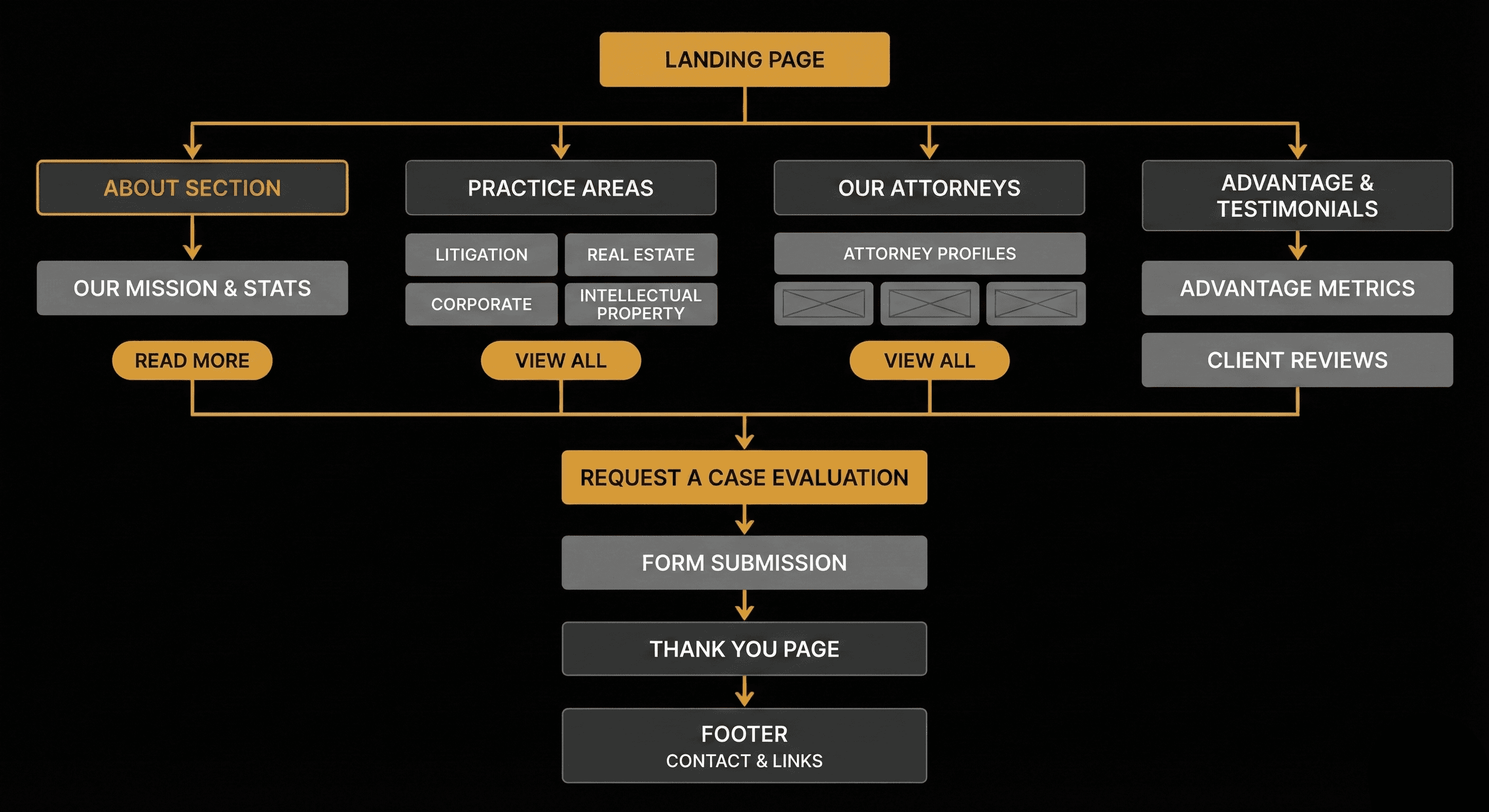
USER FLOW:
USER INSIGHTS & KEY ACTIONS:
Users seeking legal help often experience urgency, emotional stress, or uncertainty. They need quickly digestible information, straightforward navigation, and credibility signals. The design actions targeted these needs by improving scannability, reducing friction, and providing immediate clarity.
• Presented experience metrics prominently to build instant trust.
• Displayed practice areas in a grid for effortless comparison.
• Used real attorney photos to strengthen relatability and reduce distance.
• Added testimonial sections to reinforce social proof.
• Included repeated contact opportunities to accommodate different user entry points.
• Ensured pricing visibility to reduce hesitation and increase inquiry confidence.
• Created a structured footer for secondary navigation and legal disclaimers.
WCAG: Visuals were audited for inclusivity. The Gold typography against the Dark background achieves a 4.5:1+ contrast ratio, meeting WCAG AA standards to ensure legibility for all users.

THE SOLUTION:
The final website UI delivers a balanced experience that blends sophistication with functional clarity. Each section supports user decision-making while reinforcing Wellington Legal’s authority and credibility. The design introduces clarity, refined visual identity, and structured content that simplifies exploration and encourages consultation requests.
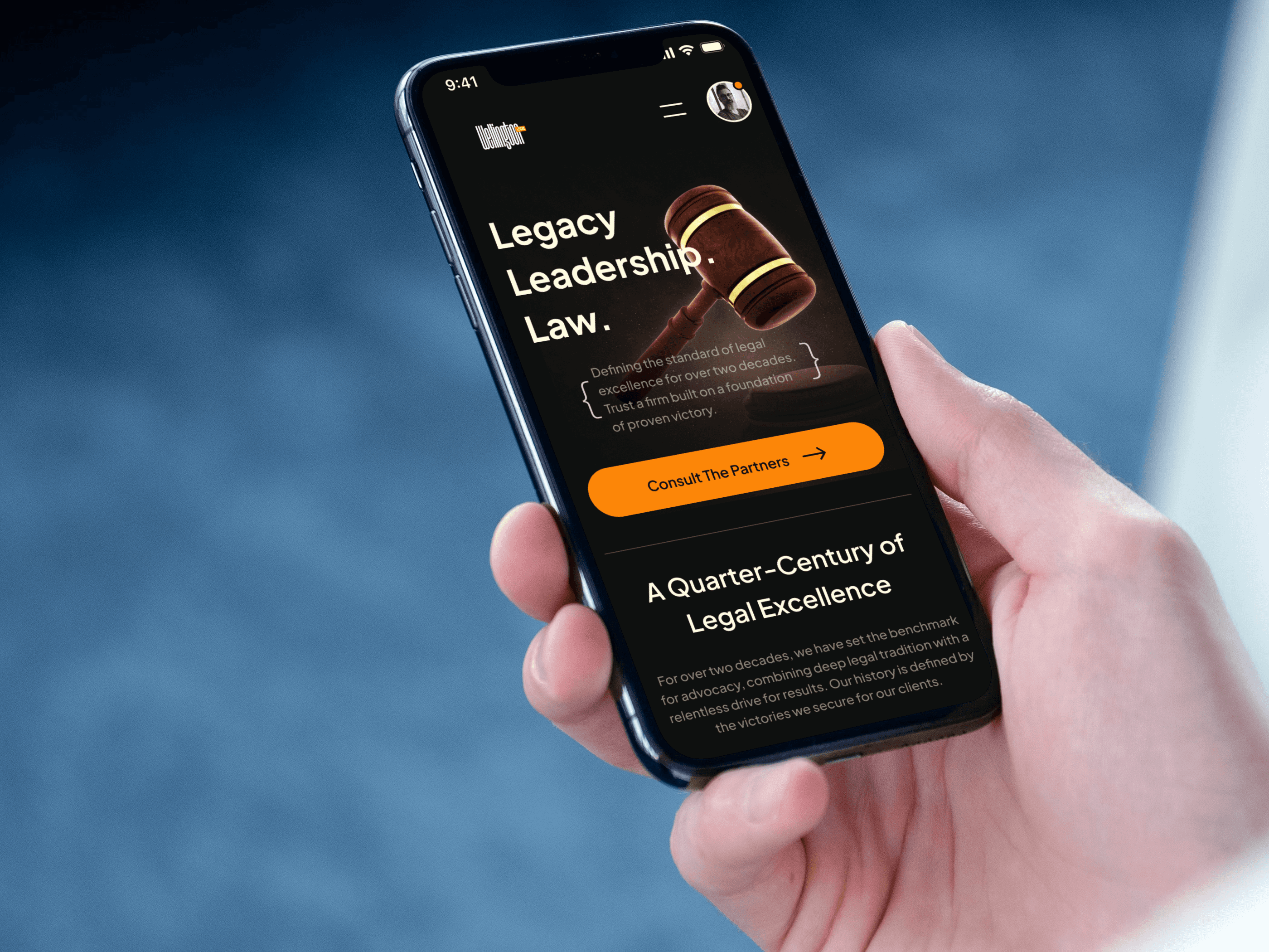
• Hero section featuring strong brand messaging and visual symbolism rooted in law and heritage.
• Metrics and firm history presented early to build immediate trust.
• Practice area grid providing quick comprehension of services offered.
• Dedicated attorney section with portraits and roles to humanize expertise.
• Pricing tables outlining common legal services and expected cost ranges.
• Testimonial block showcasing client satisfaction and firm values.
• Contact modules for direct inquiries and structured case evaluation.
• Footer with expanded navigation and legal information for user assurance.
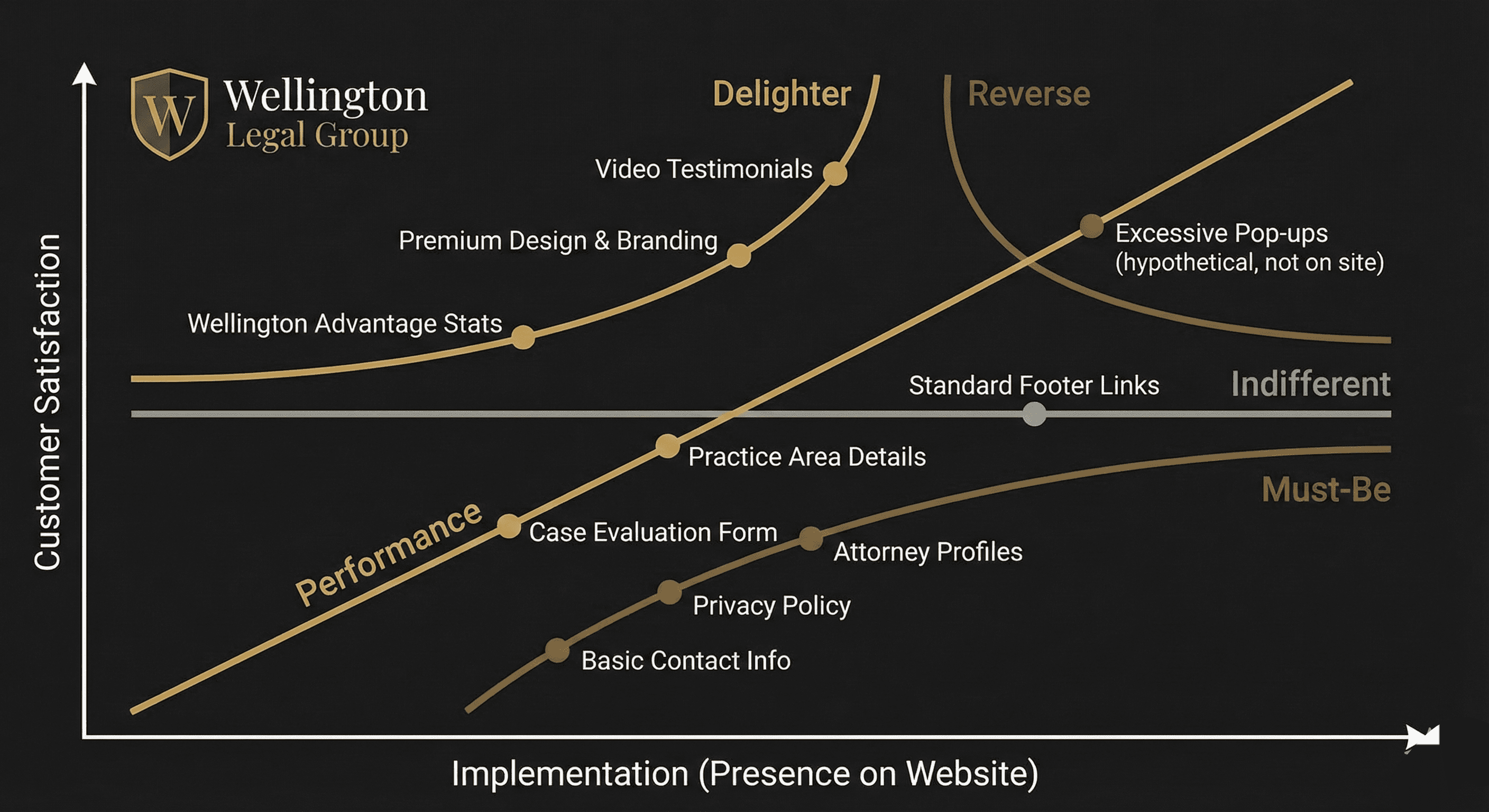
KANO MODEL:
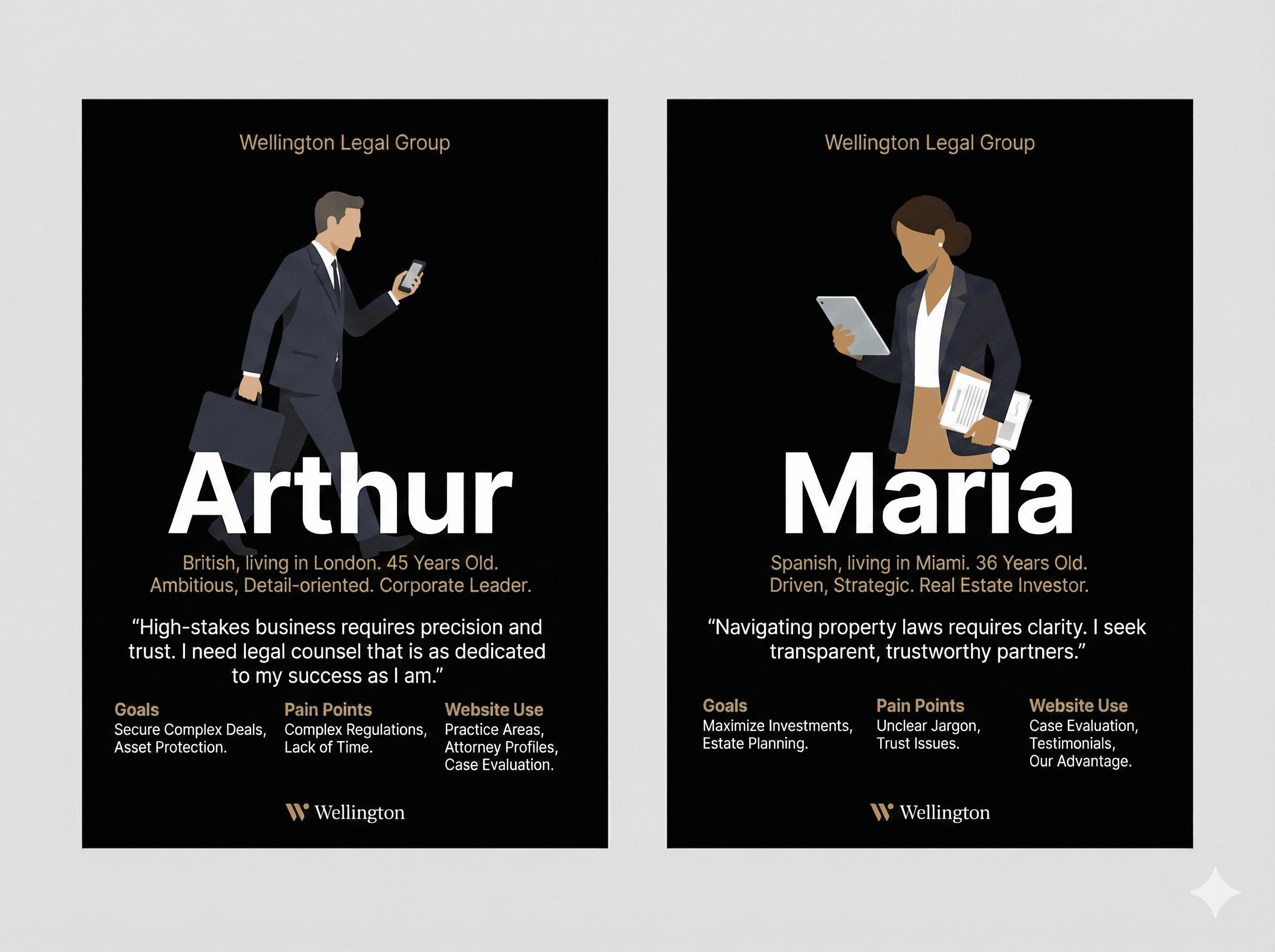
USER PERSONAS:
SCREENS:
VIDEO PREVIEW:
DEVELOPER HANDOFF:
To ensure the "premium" design vision was built efficiently and accurately, I delivered a structured handover package:
Mini Design System: Defined atomic components, typography scales, and semantic color tokens (e.g., Gold-Primary) to ensure consistency and prevent hard-coding.
Accessibility Checks: Annotated specific color combinations to ensure Gold text against dark backgrounds met WCAG AA contrast standards.
Interaction Specs: Documented easing curves for hover states and transitions to ensure motion felt "dignified" rather than fast or bouncy.
Asset Optimization: Exported all "legacy" imagery in WebP format and icons as SVGs to maintain fast load times without sacrificing visual richness.
OUTCOME / RESULT:
The final platform successfully translates Wellington Legal’s 20-year heritage into a commanding digital presence. The design establishes immediate authority through a refined "Legacy" aesthetic, while the streamlined information architecture ensures users can navigate complex legal services with clarity. By balancing high-end visuals with WCAG-compliant accessibility, the site turns visitor uncertainty into client confidence, providing a seamless path from discovery to consultation.
LEARNING / CONCLUSION:
This project reaffirmed the value of clarity and trust-building in service-driven industries. A strong hierarchy, thoughtful visuals, and transparent communication enable law firms to create confidence from the first interaction. The resulting interface demonstrates how intentional UI design can turn a traditional legal brand into a modern, persuasive online experience.
More Works
(HNS® — 02)

FAQ
01
What’s your typical workflow for new projects?
02
How do you determine project timelines?
03
Do you design for both web and mobile?
04
What are your payment terms?
05
Can I update my website or app after launch?
06
Do you only work on fixed projects, or do you offer ongoing support?
07
Can you help with branding too?
08
What file formats will I receive for design handoff?
ABOUT THE BRAND:
Wellington Legal positions itself as a legacy-driven law firm with over two decades of expertise across corporate, civil, and family legal services. The brand identity requires sophistication, credibility, and restraint, supported by minimal typography, deliberate spacing, and photography that reinforces professionalism. The website serves as a core touchpoint for establishing trust and encouraging prospective clients to engage with the firm.
PROJECT OVERVIEW:
This project focused on creating a premium digital presence for Wellington Legal, a law firm emphasizing heritage, authority, and contemporary legal expertise. The goal was to design a complete website interface that communicates trust, professionalism, and clarity while guiding potential clients toward consultation and case evaluation services. The site needed a strong visual hierarchy, accessible information architecture, and a modern brand expression aligned with the firm’s reputation.
PROJECT GOAL:
The objective was to create a complete website UI system that communicates authority while remaining intuitive for users seeking legal support. The design needed to highlight the firm's experience, showcase service categories, and make attorney profiles easily discoverable. A seamless path from information gathering to consultation booking was essential.
MY ROLE:
Product Designer
Responsible for UX strategy, information architecture, visual direction, and full UI execution. Managed the end-to-end design process, including layout systems, typography, color direction, component structure, interaction design, and content hierarchy. Ensured the final interface aligned with the firm’s brand values and communicated professionalism and trustworthiness across all touchpoints.
THE PROBLEM
Despite two decades of offline success, Wellington Legal suffered from a "digital trust gap." Without an online presence, prospective clients had no way to verify the firm’s expertise, attorney credentials, or service scope before reaching out.
The challenge was to build a foundational platform (0-to-1) that could translate their physical reputation into a digital experience, establishing instant authority and removing hesitation for high-stakes clients.
Trust Translation: Converting 20 years of legacy into an intuitive UI.
Information Void: Users lacked critical decision-making data (Pricing, Expertise).
Credibility Risk: "Invisible" firms are perceived as outdated or risky by modern clients.
THE APPROACH AND PROCESS:
The design process prioritized clarity, emotional trust-building, and organized discovery paths for users who may be stressed or time-constrained. The approach used a content-first structure, enabling each section to reinforce expertise while supporting conversion-oriented navigation.
• Defined a clear content hierarchy based on user intent: learn about the firm, explore services, evaluate attorneys, review pricing, and initiate contact.
• Developed a refined visual language using dark surfaces and golden accents to communicate tradition and confidence.
• Structured service categories and practice areas with concise microcopy to reduce cognitive load.
• Designed attorney spotlight cards with portrait photography to humanize the firm.
• Added transparent pricing tables to help users understand service tiers without ambiguity.
• Implemented persuasive elements such as testimonials, industry trust badges, and recognition logos.
• Designed lead-generation modules including contact forms and case evaluation requests.
• Ensured consistent spacing, alignment, and typography for legibility across the interface.
WIREFRAMING:
USER FLOW:
USER INSIGHTS & KEY ACTIONS:
Users seeking legal help often experience urgency, emotional stress, or uncertainty. They need quickly digestible information, straightforward navigation, and credibility signals. The design actions targeted these needs by improving scannability, reducing friction, and providing immediate clarity.
• Presented experience metrics prominently to build instant trust.
• Displayed practice areas in a grid for effortless comparison.
• Used real attorney photos to strengthen relatability and reduce distance.
• Added testimonial sections to reinforce social proof.
• Included repeated contact opportunities to accommodate different user entry points.
• Ensured pricing visibility to reduce hesitation and increase inquiry confidence.
• Created a structured footer for secondary navigation and legal disclaimers.
WCAG: Visuals were audited for inclusivity. The Gold typography against the Dark background achieves a 4.5:1+ contrast ratio, meeting WCAG AA standards to ensure legibility for all users.
THE SOLUTION:
The final website UI delivers a balanced experience that blends sophistication with functional clarity. Each section supports user decision-making while reinforcing Wellington Legal’s authority and credibility. The design introduces clarity, refined visual identity, and structured content that simplifies exploration and encourages consultation requests.
• Hero section featuring strong brand messaging and visual symbolism rooted in law and heritage.
• Metrics and firm history presented early to build immediate trust.
• Practice area grid providing quick comprehension of services offered.
• Dedicated attorney section with portraits and roles to humanize expertise.
• Pricing tables outlining common legal services and expected cost ranges.
• Testimonial block showcasing client satisfaction and firm values.
• Contact modules for direct inquiries and structured case evaluation.
• Footer with expanded navigation and legal information for user assurance.
KANO MODEL:
USER PERSONAS:
SCREENS:
VIDEO PREVIEW:
DEVELOPER HANDOFF:
To ensure the "premium" design vision was built efficiently and accurately, I delivered a structured handover package:
Mini Design System: Defined atomic components, typography scales, and semantic color tokens (e.g., Gold-Primary) to ensure consistency and prevent hard-coding.
Accessibility Checks: Annotated specific color combinations to ensure Gold text against dark backgrounds met WCAG AA contrast standards.
Interaction Specs: Documented easing curves for hover states and transitions to ensure motion felt "dignified" rather than fast or bouncy.
Asset Optimization: Exported all "legacy" imagery in WebP format and icons as SVGs to maintain fast load times without sacrificing visual richness.
OUTCOME / RESULT:
The final platform successfully translates Wellington Legal’s 20-year heritage into a commanding digital presence. The design establishes immediate authority through a refined "Legacy" aesthetic, while the streamlined information architecture ensures users can navigate complex legal services with clarity. By balancing high-end visuals with WCAG-compliant accessibility, the site turns visitor uncertainty into client confidence, providing a seamless path from discovery to consultation.
LEARNING / CONCLUSION:
This project reaffirmed the value of clarity and trust-building in service-driven industries. A strong hierarchy, thoughtful visuals, and transparent communication enable law firms to create confidence from the first interaction. The resulting interface demonstrates how intentional UI design can turn a traditional legal brand into a modern, persuasive online experience.
More Works
(HNS® — 02)
FAQ
01
What’s your typical workflow for new projects?
02
How do you determine project timelines?
03
Do you design for both web and mobile?
04
What are your payment terms?
05
Can I update my website or app after launch?
06
Do you only work on fixed projects, or do you offer ongoing support?
07
Can you help with branding too?
08
What file formats will I receive for design handoff?
ABOUT THE BRAND:
Wellington Legal positions itself as a legacy-driven law firm with over two decades of expertise across corporate, civil, and family legal services. The brand identity requires sophistication, credibility, and restraint, supported by minimal typography, deliberate spacing, and photography that reinforces professionalism. The website serves as a core touchpoint for establishing trust and encouraging prospective clients to engage with the firm.
PROJECT OVERVIEW:
This project focused on creating a premium digital presence for Wellington Legal, a law firm emphasizing heritage, authority, and contemporary legal expertise. The goal was to design a complete website interface that communicates trust, professionalism, and clarity while guiding potential clients toward consultation and case evaluation services. The site needed a strong visual hierarchy, accessible information architecture, and a modern brand expression aligned with the firm’s reputation.
PROJECT GOAL:
The objective was to create a complete website UI system that communicates authority while remaining intuitive for users seeking legal support. The design needed to highlight the firm's experience, showcase service categories, and make attorney profiles easily discoverable. A seamless path from information gathering to consultation booking was essential.
MY ROLE:
Product Designer
Responsible for UX strategy, information architecture, visual direction, and full UI execution. Managed the end-to-end design process, including layout systems, typography, color direction, component structure, interaction design, and content hierarchy. Ensured the final interface aligned with the firm’s brand values and communicated professionalism and trustworthiness across all touchpoints.
THE PROBLEM
Despite two decades of offline success, Wellington Legal suffered from a "digital trust gap." Without an online presence, prospective clients had no way to verify the firm’s expertise, attorney credentials, or service scope before reaching out.
The challenge was to build a foundational platform (0-to-1) that could translate their physical reputation into a digital experience, establishing instant authority and removing hesitation for high-stakes clients.
Trust Translation: Converting 20 years of legacy into an intuitive UI.
Information Void: Users lacked critical decision-making data (Pricing, Expertise).
Credibility Risk: "Invisible" firms are perceived as outdated or risky by modern clients.
THE APPROACH AND PROCESS:
The design process prioritized clarity, emotional trust-building, and organized discovery paths for users who may be stressed or time-constrained. The approach used a content-first structure, enabling each section to reinforce expertise while supporting conversion-oriented navigation.
• Defined a clear content hierarchy based on user intent: learn about the firm, explore services, evaluate attorneys, review pricing, and initiate contact.
• Developed a refined visual language using dark surfaces and golden accents to communicate tradition and confidence.
• Structured service categories and practice areas with concise microcopy to reduce cognitive load.
• Designed attorney spotlight cards with portrait photography to humanize the firm.
• Added transparent pricing tables to help users understand service tiers without ambiguity.
• Implemented persuasive elements such as testimonials, industry trust badges, and recognition logos.
• Designed lead-generation modules including contact forms and case evaluation requests.
• Ensured consistent spacing, alignment, and typography for legibility across the interface.
WIREFRAMING:
USER FLOW:
USER INSIGHTS & KEY ACTIONS:
Users seeking legal help often experience urgency, emotional stress, or uncertainty. They need quickly digestible information, straightforward navigation, and credibility signals. The design actions targeted these needs by improving scannability, reducing friction, and providing immediate clarity.
• Presented experience metrics prominently to build instant trust.
• Displayed practice areas in a grid for effortless comparison.
• Used real attorney photos to strengthen relatability and reduce distance.
• Added testimonial sections to reinforce social proof.
• Included repeated contact opportunities to accommodate different user entry points.
• Ensured pricing visibility to reduce hesitation and increase inquiry confidence.
• Created a structured footer for secondary navigation and legal disclaimers.
WCAG: Visuals were audited for inclusivity. The Gold typography against the Dark background achieves a 4.5:1+ contrast ratio, meeting WCAG AA standards to ensure legibility for all users.
THE SOLUTION:
The final website UI delivers a balanced experience that blends sophistication with functional clarity. Each section supports user decision-making while reinforcing Wellington Legal’s authority and credibility. The design introduces clarity, refined visual identity, and structured content that simplifies exploration and encourages consultation requests.
• Hero section featuring strong brand messaging and visual symbolism rooted in law and heritage.
• Metrics and firm history presented early to build immediate trust.
• Practice area grid providing quick comprehension of services offered.
• Dedicated attorney section with portraits and roles to humanize expertise.
• Pricing tables outlining common legal services and expected cost ranges.
• Testimonial block showcasing client satisfaction and firm values.
• Contact modules for direct inquiries and structured case evaluation.
• Footer with expanded navigation and legal information for user assurance.
KANO MODEL:
USER PERSONAS:
SCREENS:
VIDEO PREVIEW:
DEVELOPER HANDOFF:
To ensure the "premium" design vision was built efficiently and accurately, I delivered a structured handover package:
Mini Design System: Defined atomic components, typography scales, and semantic color tokens (e.g., Gold-Primary) to ensure consistency and prevent hard-coding.
Accessibility Checks: Annotated specific color combinations to ensure Gold text against dark backgrounds met WCAG AA contrast standards.
Interaction Specs: Documented easing curves for hover states and transitions to ensure motion felt "dignified" rather than fast or bouncy.
Asset Optimization: Exported all "legacy" imagery in WebP format and icons as SVGs to maintain fast load times without sacrificing visual richness.
OUTCOME / RESULT:
The final platform successfully translates Wellington Legal’s 20-year heritage into a commanding digital presence. The design establishes immediate authority through a refined "Legacy" aesthetic, while the streamlined information architecture ensures users can navigate complex legal services with clarity. By balancing high-end visuals with WCAG-compliant accessibility, the site turns visitor uncertainty into client confidence, providing a seamless path from discovery to consultation.
LEARNING / CONCLUSION:
This project reaffirmed the value of clarity and trust-building in service-driven industries. A strong hierarchy, thoughtful visuals, and transparent communication enable law firms to create confidence from the first interaction. The resulting interface demonstrates how intentional UI design can turn a traditional legal brand into a modern, persuasive online experience.
More Works
FAQ
What’s your typical workflow for new projects?
How do you determine project timelines?
Do you design for both web and mobile?
What are your payment terms?
Can I update my website or app after launch?
Do you only work on fixed projects, or do you offer ongoing support?
Can you help with branding too?
What file formats will I receive for design handoff?